Smooj was the brainchild of Tommy Kennedy and Nick Panchamé of Homes Brewery, an Ann Arbor, Michigan brewery known for wild one-offs, surprise drops, and a die-hard local following. When they came to us, they had a new kind of drink on their hands: thick, frothy, fruity, and a bit magical.
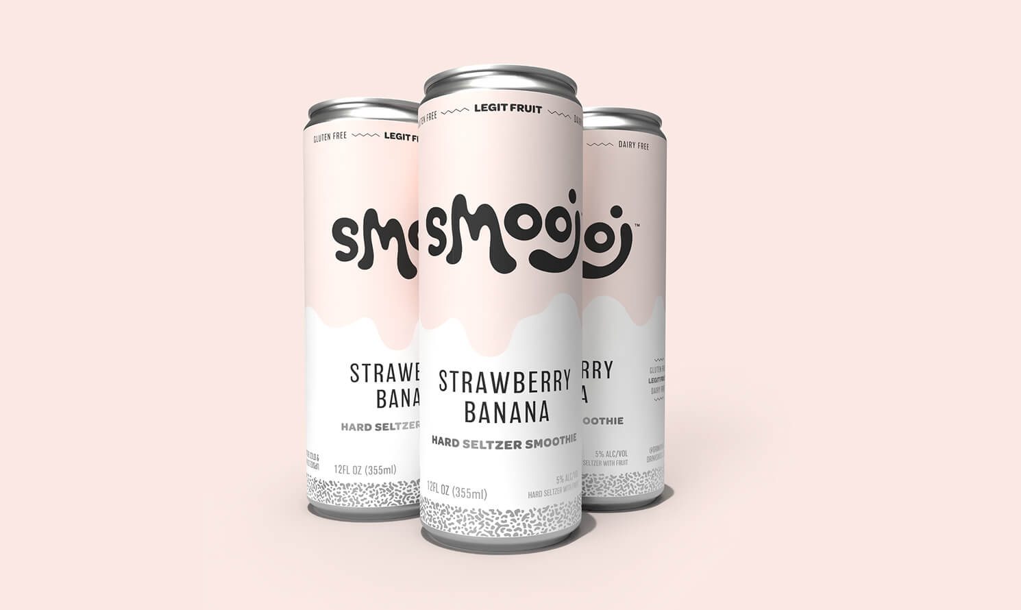
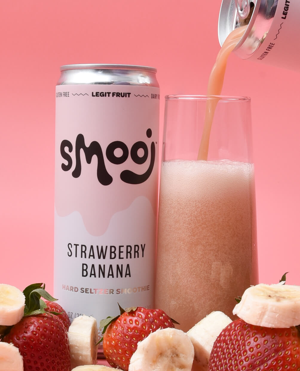
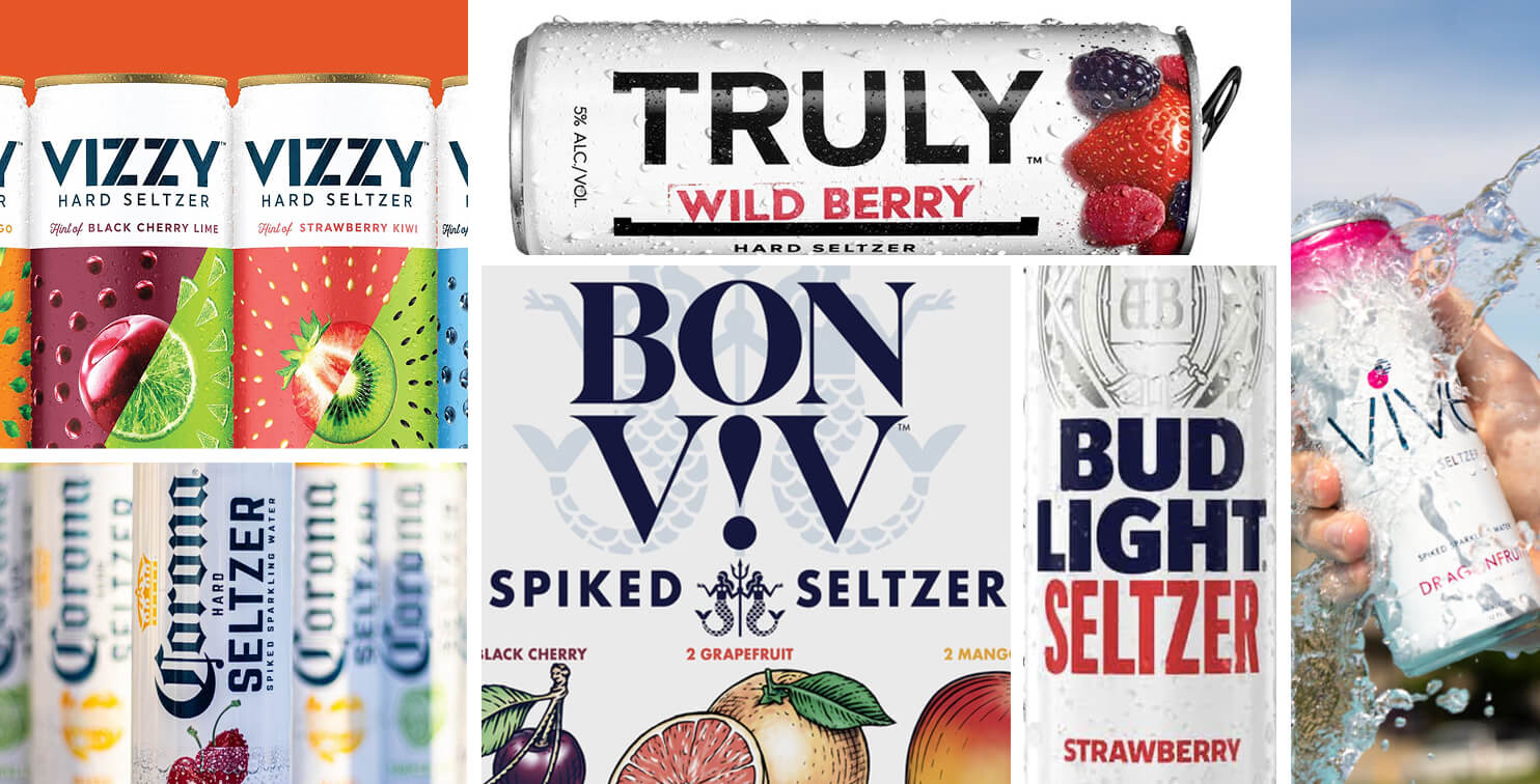
The creative ask was just as tasty. “Look unlike anything else in seltzer”. Smooj was meant to be the yacht rock to Homes’ rock-and-roll. They were insistent about carving their own path on shelf. It was 2020, and the seltzer category followed a strict playbook. White cans. Crisp type. Bold fruity colors. Smooj was something else entirely—it poured like a smoothie and was totally crushable. It had to show up accordingly.
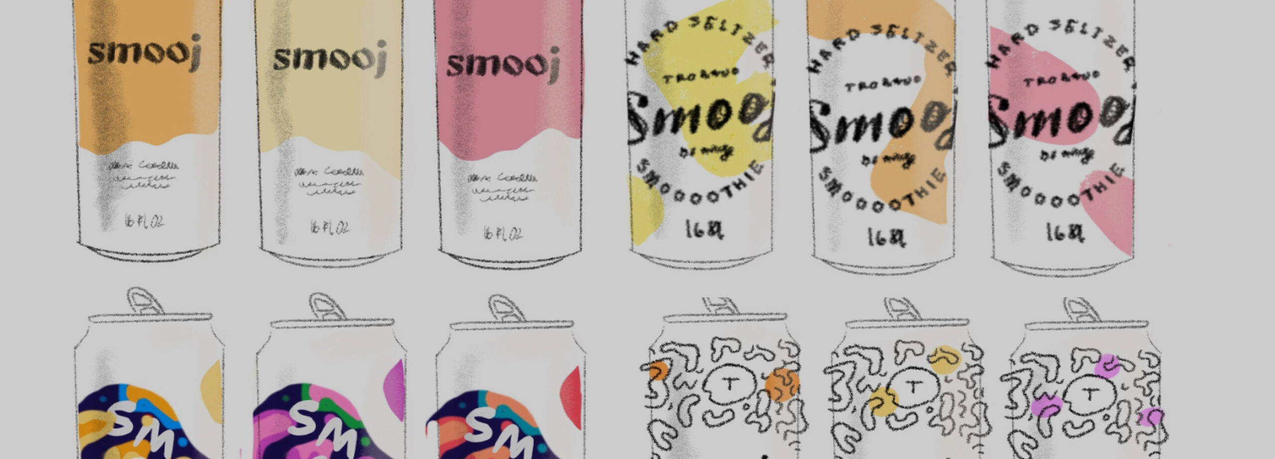
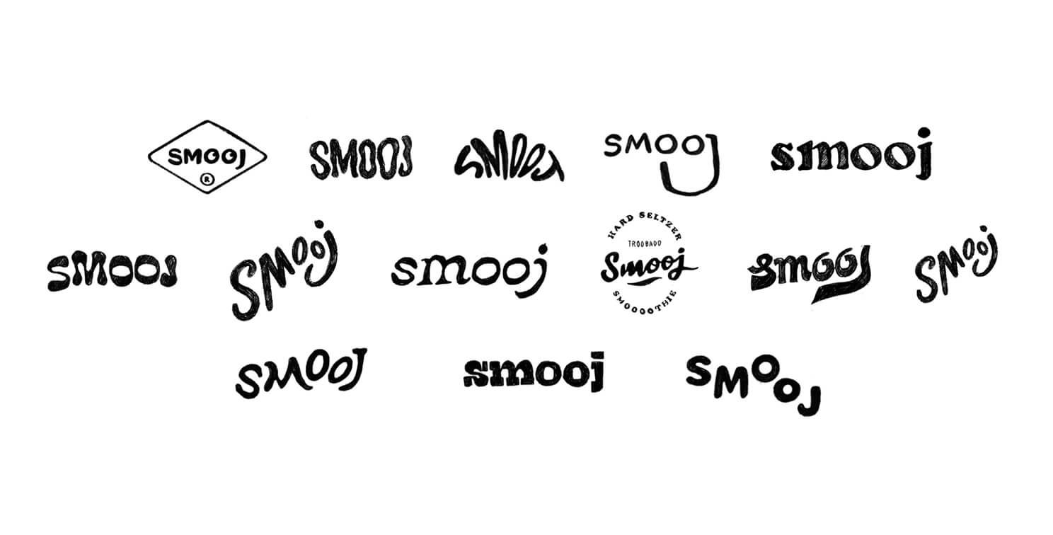
There was no starting reference point for Smooj—no existing category clues. I started sketching, my partner started writing, and we volleyed until the right mix of words and images clicked. Hundreds of logos. Dozens of cans. Sharing with Tommy and the Homes crew until we found the one that felt just wrong enough to be right.
Along the way, we kept coming back to the naturally occurring face: ‘OO’ as eyes, ‘J’ as a grin. Homes had explored it before we came on board, and we knew if we could make it work, it’d be a killer secondary mark—perfect for social, swag, and shorthand moments.
When we finished, it was so wild, so unlike anything out there, we had no clue how it would land. I was equal parts hyped and scared shitless. But Smooj found its people—and people found Smooj. It sold out everywhere. Folks were clamoring. I remember spotting a DIY Smooj available here sign at a corner store. That was the first time I saw it in the wild, and I thought, oh man… we’ve got something here.
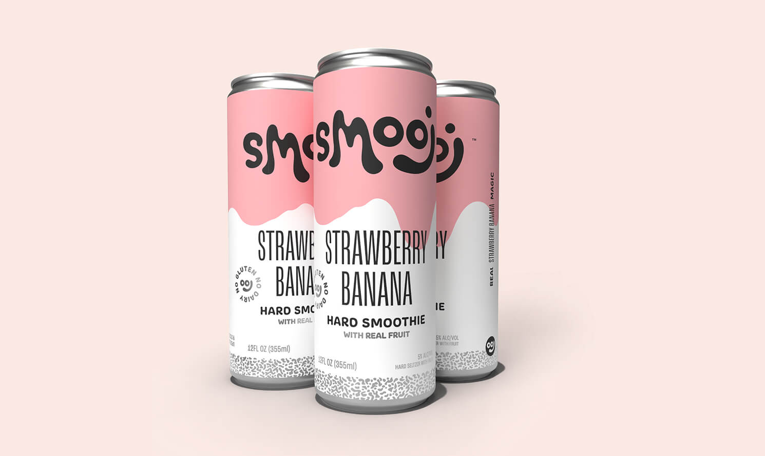
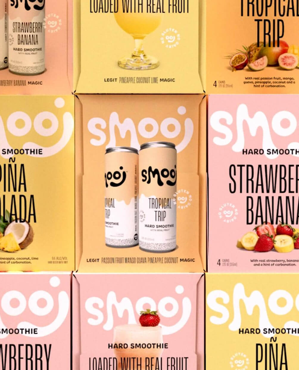
It gained a cult following fast. A year or two later, when it was time to go wider, we got the call up to evolve the brand. And lucky for us, we had a solid couple years of real-world feedback. We’d seen it on shelves, in fridges, in bars, all over social. We knew where to tighten things up.
We kept what worked, the logo, the drip, the vibe. We made some evolutionary shifts: a little more color, brought more confidence to flavor names, updated callouts, and we carved out a little more room for the beloved “ooj” face. The cartons, though, got a full overhaul. Retailers wanted clearer flavor cues, and we heard them. We added juicy, lush, piles of fruit, anchored by an oversized logo. Every panel was refined with new art, fresh language, and details pulled from the updated can. We also built out a system for seasonal drops and Smooj Lab releases, giving the Homes team a flexible but cohesive toolkit to play with.