Approach
A Proven Process for Building Brands
Branding for consumer packaged goods (CPG) comes with unique challenges. What works for a small start-up brand with only a few SKUs won’t continue to resonate with consumers as that small biz scales. And no matter how tasty the product is, if it’s not appealing on shelf or online, it’s never going to end up where it needs to be—in carts, in pantries, and on tables for people to enjoy.
In our time working with award-winning CPG brands, we’ve developed an approach to CPG branding that helps businesses reach their next milestone effectively and creatively. It starts with a guiding story that can inform all creative work then validating that story with real industry insights and consumer data, to ensure a good idea is the right idea to get your brand to new heights.
Branding & CPG is our bread and butter
01 /
Crafting Your Capstone
On the ancient pyramids, capstones were the most elaborate piece of a pyramid, used to worship gods and emperors, and signal the completion of the pyramid. These capstones were capped in gold and celebrated the life and legacy of whoever is entombed inside.
When we build our pyramids, we take a different approach. Our Brand Pyramids start with the Capstone, where we explore a variety of conceptual options that uniquely position the story and legacy of a brand within its category.
A Capstone is a brand’s big idea, a guiding ethos, the shorthand concept that people can recognize on sight and without context. And they aren’t limited to words alone—we use unique visual paths to support and communicate a brand’s idea, also ensuring your CPG package stands out on shelves and against competitors.
A good Capstone is…
Always rooted in a strategic insight
A concept that can be built on visually and verbally
A long-term ownable position within the category
02 /
Crafting Your Brand Pyramid
With a Capstone story locked in that’s true to the brand (where it is now and where it will be in the future), we build the Brand Pyramid. A brand isn’t a brand without an audience to support it, so the next “layer” that supports the Capstone is your audience. We’ll create your ideal growth persona using psychographic and demographic insights, building their world and holding up all creative work in that world to ensure it’s compelling and resonate.
As we move down the pyramid, we identify just what you as a brand offer them—while a Capstone will cover the emotional reason a consumer should love your product, identifying the “what” will give you a clearer way to communicate directly to your audience. And finally, we round out the basic Brand Pyramid with what makes you unique, identifying distinct RTBs that make your brand stand out in the marketplace.
03 /
Consumer Touchpoints & Bricks
Obviously, a brand doesn’t end with a new look and identifying what makes you unique. We view our Brand Pyramids as living things, almost turnkey in approach. The bigger your brand needs to be, the more “bricks” we need to add to build it up. Bricks are related to customer or consumer touchpoints, things like your packaging, website, photography, tradeshows, etc.
By crafting more bricks (guided by the Capstone), we help your brand build how it shows up in the world to your customers, consumers, and even your internal team. While each brick has unique requirements, when seen together, these bricks present a cohesive whole across channels and formats.
04 /
We Know (and Grow) CPG
When you find yourself at a pivotal moment in your business’s story—expanding product lines, new management, new retail buyers, or eyeing an acquisition—trust in your partners is paramount. Our approach is tailor-made for CPG brands by balancing the art and science, creativity and data-validation, visual eye-candy and strategic reasoning needed to win on shelves, online, and IRL.
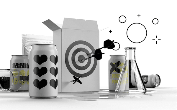
Packaging Lab