Fresh fit for your favorite crunch.
Tom Waits once said it’s “getting harder and harder to find a bad cup of coffee.” He was onto something. Not just about coffee, but about how even the simplest things now feel the need to try a little too hard. Brownie Brittle came to us knowing exactly who they were: a crunchy, crispy, slightly indulgent chocolate treat. No posturing. No wellness halo. Just a freakishly good snack that delivers.
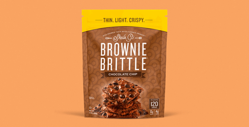
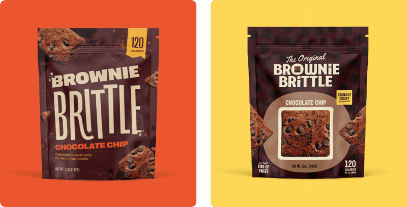
Great snack, but the packaging hadn’t kept up. No one could find it, and when they did, it didn’t do much to pull them in. One piece of early shopper feedback stuck with us: “it looks like it came out of granny’s cupboard”. Glossy. Dated. And even worse, boring.
This brand has loyalists. Nurses can’t get enough of it during long shifts. People grab it at airports. A “treat yourself” moment if there ever was one. Brownie Brittle already lived squarely in treat culture. Our job was to help it show up just right. You can’t crave what you can’t see.
We set out to find the right opportunity in the aisle—something Brownie Brittle could genuinely own. They already had some standout traits: chocolatey, crunchy, and quite literally the square peg in a round-cookie aisle. We saw potential to lean into that. So we started sketching around two directions. (We always begin with packaging, even when we’re building a full brand system. It’s the best way to make sure the brand works where it matters most.)
The first path was The Crispy Crunchy Chocolatey Treat—full of angled lines, break marks, modern energy, and a little bit of chaos in the best way. The second was The Hip to Be Square Brand—a literal play on shape, a little tongue-in-cheek, slightly retro, think argyle v-neck sweater.
The client was immediately drawn to the crispy crunchy direction. Focus groups agreed. That was the path. Now we had to perfect it.
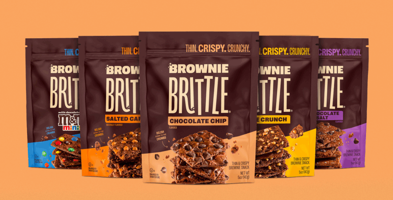
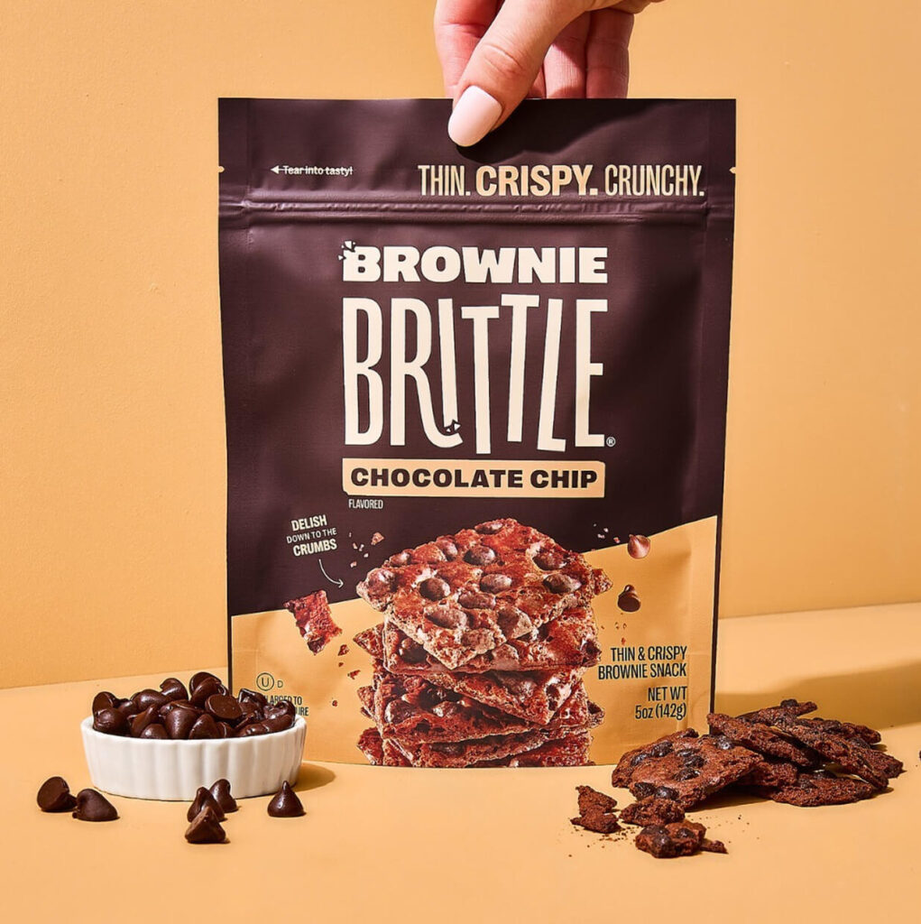
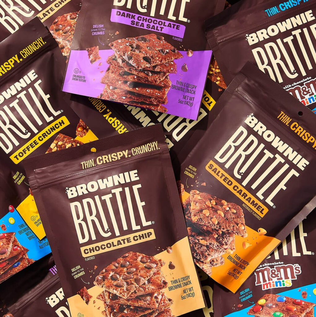
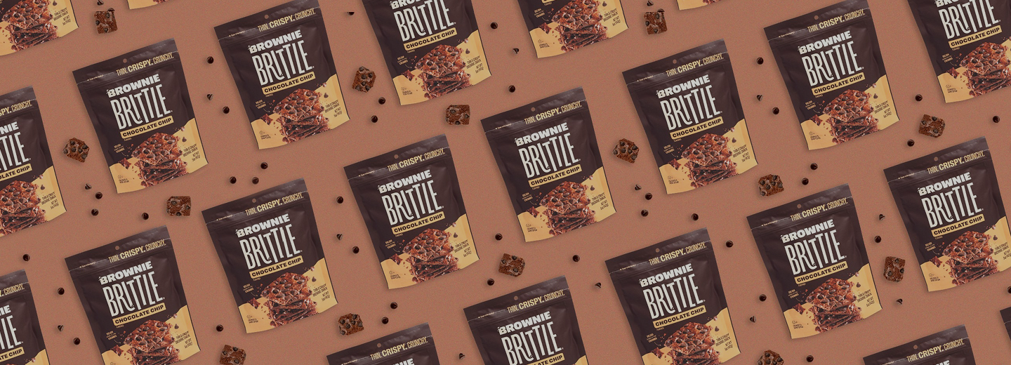
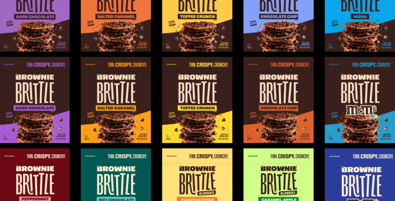
We knew the brand needed to block on shelf, to own space and create quick flavor recognition. The team was set on bold bright colors to help tell the crispy crunchy story, but when we tried shelf sets brand block was non-existent. This led to further sketches, more exploration, and finally the solution we landed on. Strong color block on top, expressive colors that tie perfectly in with flavor on the lower third. Everything had to work within a system that could scale, from Costco club packs to sample sized pillow packs.
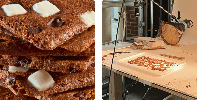
The photography was its own challenge – Brownie Brittle is thin, but the camera made it look chunky. The camera really does add 10 pounds. We shot 4-5 hero shots in studio and put each version into layout, then took those layouts into real consumer testing. We had angles we liked more from a layout perspective, but consumers eat with their eyes and we wanted to nail the tastiness. The clear winner was somewhere between ¾ and ⅞. That became our front-of-pack hero.
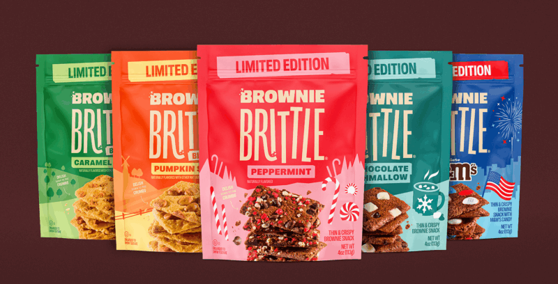
With the core of the brand done, and the packaging layout locked in, the brand world expanded quickly. Seasonal packs became their own small (but connected) land. Fall brought farms and pumpkins. Winter gave us winding roads, mugs of cocoa, and snow-topped mountains. The system stretched without snapping, and it still felt like Brownie Brittle through and through.
Today Brownie Brittle finally has a pack that feels at home wherever it lands, whether that’s a grocery aisle, a gift shop, or an airport lounge. We didn’t just refresh the design. We helped the brand find its truer self.
We didn’t overthink it. We just listened. The product already had a personality. We heard them, and put them in the spotlight.