Minimalism has had a monumental impact on design. From fashion and interior design to brand packaging, the refined elements of minimalism are everywhere. It seems more brands are removing key components of their packaging design to lean into the cleanliness of bold labels, flat backgrounds, and neutral color schemes – no fun and no flare.
Signals from fashion and interior design suggest consumers may be ready for a little more. The 2023 New York Fashion Week designs were all about excess – big shoulders, bold colors, and creative cuts reminiscent of 80’s maximalism. Meanwhile interior design is taking an organic approach with eco-maximalism. Upcycling vintage furniture while maintaining warm neutrals elevated with jewel tones, greenery, and anything that sparks joy, eco-maximalism leans into the idea of the home as a reflection of the self.
This leads us to ask: Is minimalist packaging design effective for CPG sales at retail?
It’s not a stretch to assume that the design shift will inevitably impact product and packaging design. We are already seeing the shift with eco-friendly, compostable packaging materials.
Minimalist design leans into less in an effort to combat the “more” of the world we live in. When done well, minimalism can effectively communicate the same value propositions. Executed poorly, the packaging design can leave a consumer indifferent; or worse, that your product is not for them. It’s like being on the outside of an inside joke — all of the information is there and somehow missing at the same time.
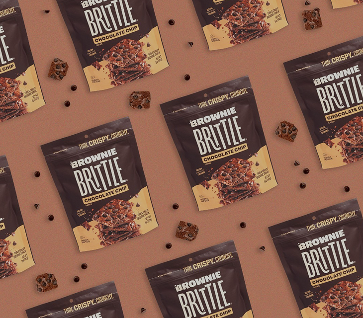
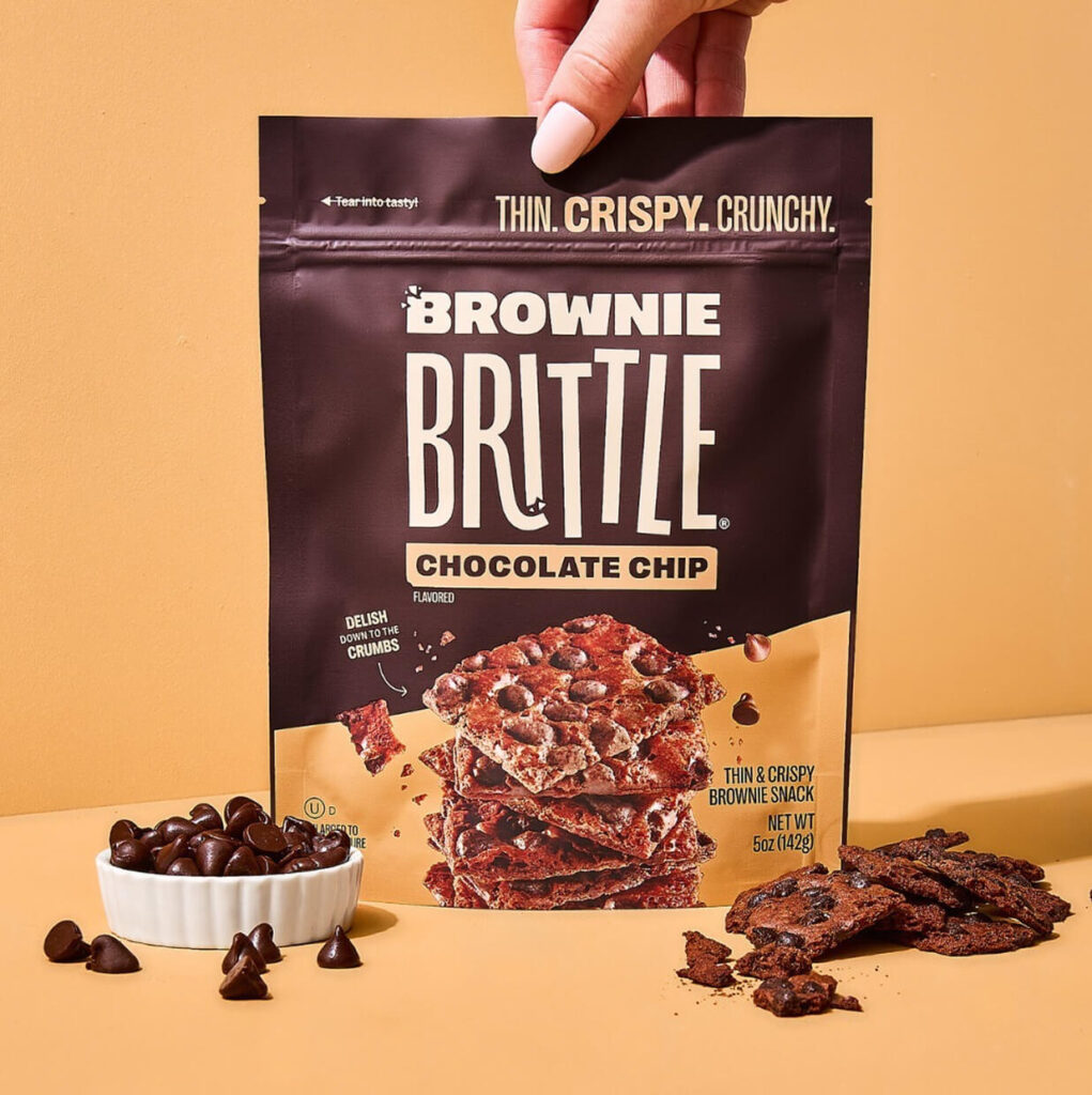
Our friends at Designalytics observed that minimalist packaging redesigns are largely underperforming because they no longer communicate attributes that are important to consumers — we noticed this trend as well when we analyzed the Kraft Mac & Cheese redesign. Sales data also suggests that the minimalist design leaves consumers hungry for more of the brand.
This is not to say it is impossible to communicate that value with a minimalist front panel, but it does mean the messaging needs to be stronger.
When legacy brands, emerging brands and store brands all look the same on the shelf, everyone loses. What appears to be a trend in generification, consumer packaged goods are starting to appear monotonous. When there is no “wow”, the consumer will look to the lowest price point, or change their mind completely.
One Design Trend Does Not Rule Them All
When it comes to brand identity and design, there is no one-size-fits-all design. A minimalist packaging design still may be right for your brand, depending on your audience.
From what we’ve seen, minimal packaging design misses the mark on messaging; neglecting strong, audience-centric cues for empty space. A more traditional or elaborate design can ensure you’re delivering the right messaging, and takes the guesswork out of the purchase decision. The best way to avoid an underperforming front panel is to align to your target consumer.
Consumer testing helps determine which attributes are important to your consumers. Starting the process early is critical to learning as much as you can from your audience and category before concepting.
You may learn your consumers appreciate a minimalist design while also giving insight to what key messages stand out for them. By testing concepts against category leaders, you can identify areas of opportunity for messaging and design influence.
Improved Communication. Better Sales.
Taking a look in the craft beer aisle, visual cues could signal a consumer to pick up an IPA by Brand A. Knowing that IPAs can pack an alcoholic punch with high ABVs, the consumer will look for this information on the packaging. If left searching, or if the information placement is in an unintuitive place, the consumer may abandon the initial choice, leaning towards an IPA with a clearer ABV placement.
Consumers have a lot of choices and the best way to improve sales is to ensure your messaging cues matter. According to Nielsen, Power, Meaning and Place are the three most impactful elements of packaging design. It is a balancing act between what grabs your consumer’s attention and makes an impression (power) with undeniable cues (meaning) visually weighted based on what the packaging is trying to communicate (place). Their research shows the existence of a branding element doesn’t guarantee the consumer will see it.
Research found a 90% correlation between improved communication and better sales. Finding the messaging sweet spot for your audience will ensure your brand isn’t muddled, and your product’s front panel is crisp, concise, and communicative.
Remember: The goal of good packaging design is to communicate value. Too many messages and the design loses focus, appearing cluttered. Too few messages and you leave key brand aspects to consumer assumptions.