Brand Strategy and Packaging Design System
Good Bread Co.:
Baking up a fresh brand
As a family-run business with nearly 50 years selling to Michigan restaurants and grocery stores, Michigan Bread seized an opportunity with Kroger to take its existing product to stores around the country. To help get them ready for the B2C-big-time, they needed a brand that would resonate with folks outside of Michigan. We set out to develop unique positioning for this commodity product and a strong brand foundation rooted in audience and market understanding.

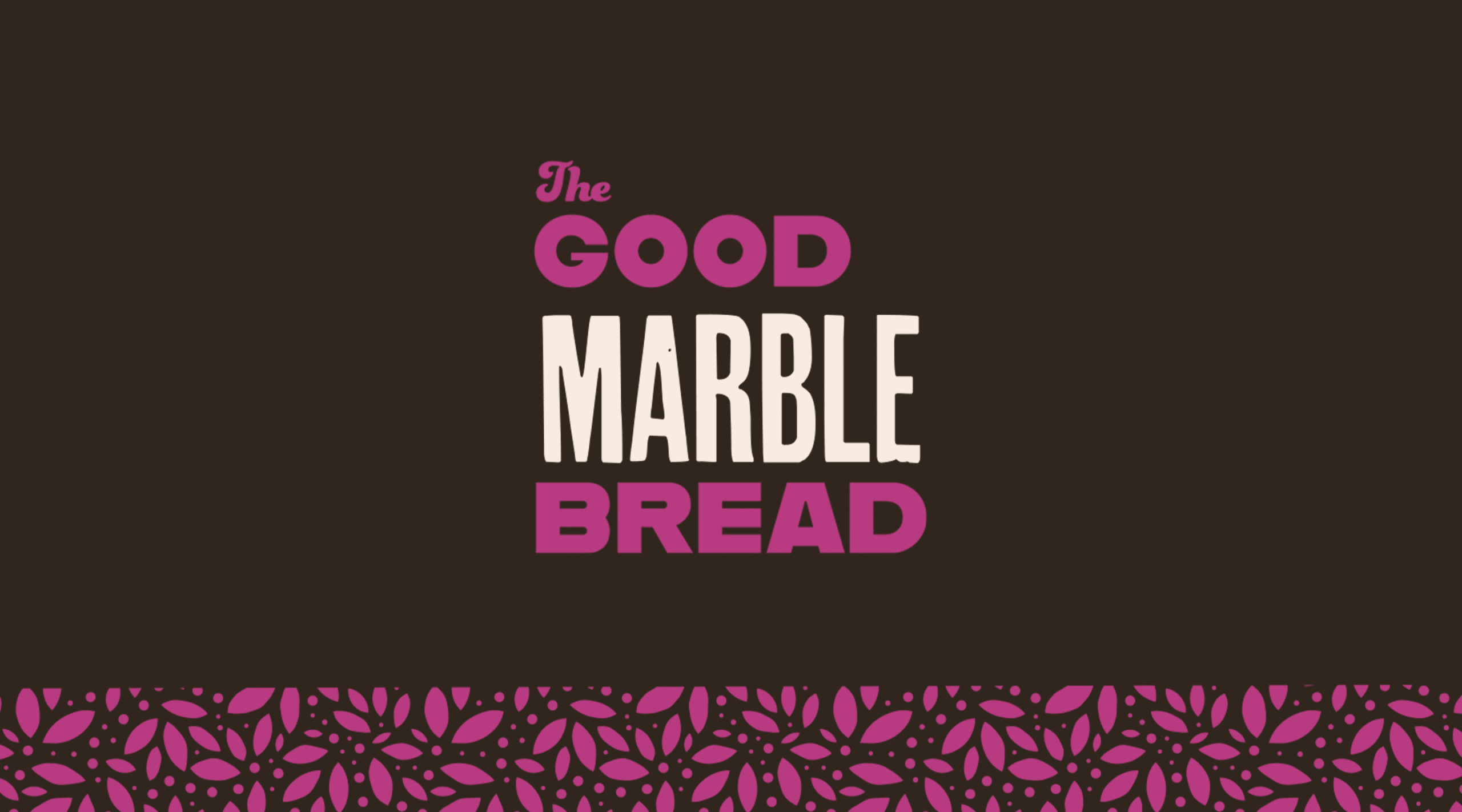
After an in-depth discovery process and market research, we positioned their brand for people looking to bring happiness, health, and something unique to their table. We coined the name The Good Bread Company as a simple reflection of their unpretentious and optimistic personality. Messaging spoke of the slow fermentation and traditional baking techniques that give their specialty bread a one-of-a-kind taste, texture, and shape.

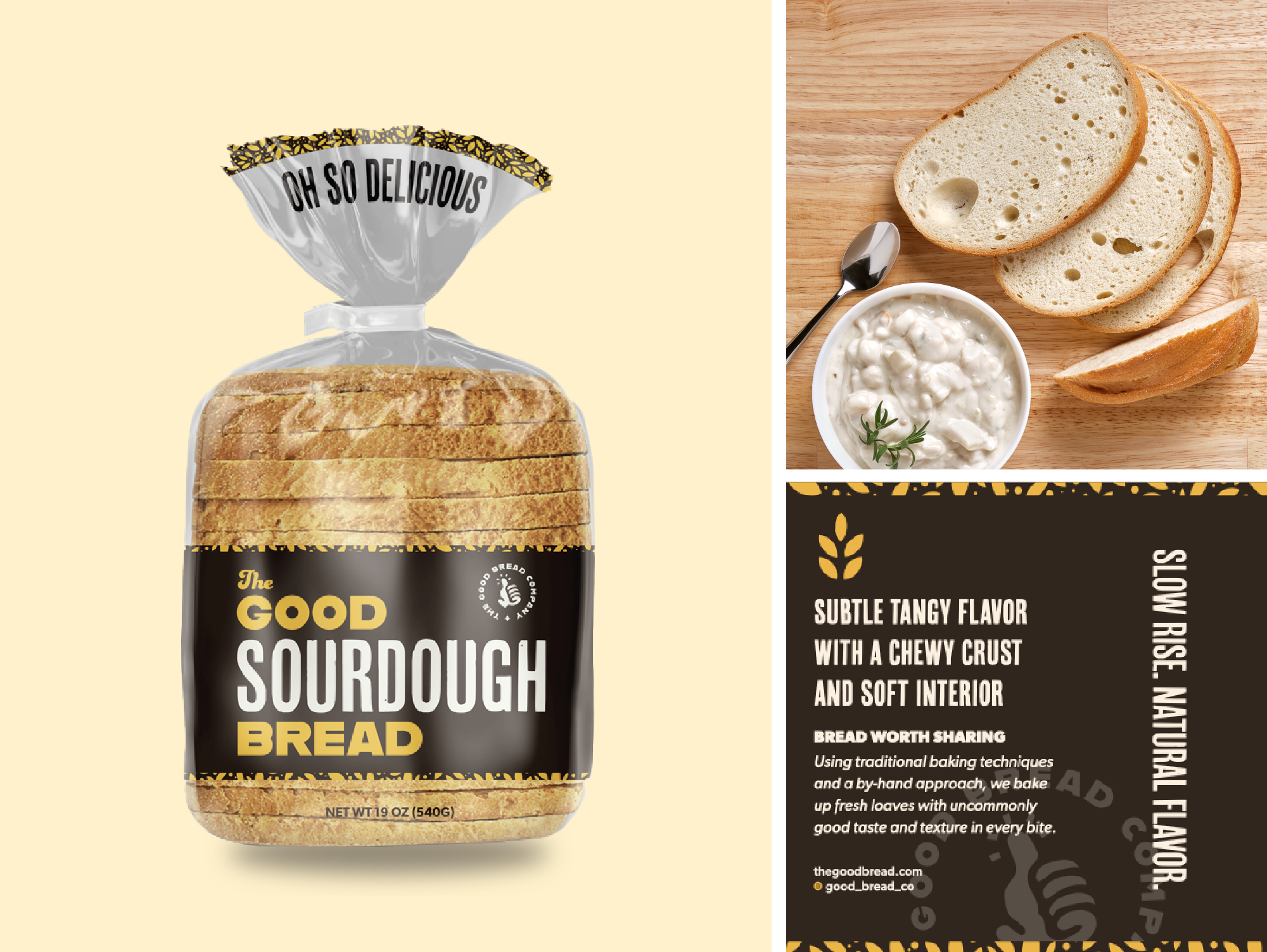
We countered the cluttered visual space with strong, straightforward approach to packaging design. Large windows showcase the product in all its beauty, with a branded band at the bottom and a beautiful pattern on the bag’s ponytail. The packaging system came with a palette of colorful brand accent colors that can grow with the product line.

Behind the scenes
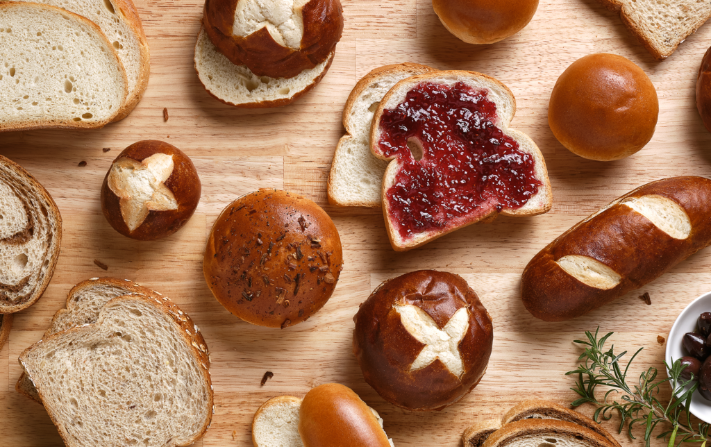
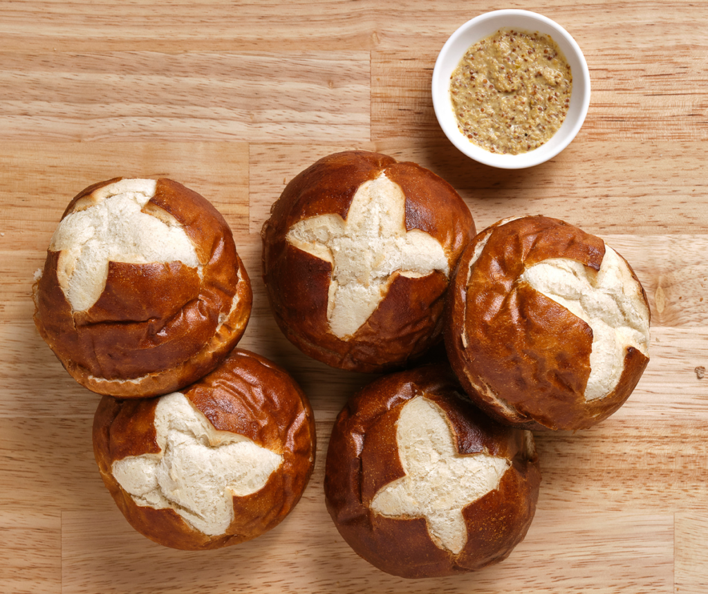
Visuals would play a crucial new piece of their consumer brand. A mix of on-white and in-use photos highlighted the bread’s texture and quality in a clean, lightly rustic setting.


The results
Armed with a new positioned brand, packaging, and a kit of marketing assets, Good Bread Co. is ready to launch as they prepare their operations for national growth. And our strategic packaging has already been put to use with the addition of a new product line, now seamlessly folded into their existing family of products.


But wait, there’s more!
We love CPG, you love CPG.
We should talk.
"*" indicates required fields

