Celebrating 10 years of great craft beers, Griffin Claw was ready for a new look and feel. Tired of inconsistent designs across the portfolio and a clunky logo, the new brand had to look good in the taproom and catch the eye of the consumer in the craft beer aisle. As fans of Griffin Claw Brewery Company, we were excited for the opportunity to work with the team to develop a brand redesign that resonates with Griffin Claw’s history and future.
With the new branding in the wild, we took some time to catch up with Scott LePage, Griffin Claw’s owner, to chat about why now was a great time to rebrand.
Q: What were your expectations coming into this project?
Scott: The craft brew industry has changed in the last 10 years. When we got into it – a fun name and a creative can design helped you sell beer. Now, with market saturation and the rise of RTDs (Ready-to-Drink) cutting into the craft beer aisle space, we knew we needed to be more dialed in and consistent so the Griffin Claw brand wasn’t convoluted.
We also wanted to raise brand awareness. Michigan is such a competitive market – there are over 50o craft breweries in Michigan alone.
Q: Let’s chat RTDs for a second – how is Griffin Claw combating the rise of craft seltzer and other ready-to-drink beverages?
Scott: The RTD shakeup really impacted most craft brewers, and I think this is where our urge to innovate has helped us. We have a vodka seltzer RTD that isn’t as sweet as some of the competitors and a new non-alcoholic hopwater option to continue to meet the evolving market without ignoring what we do best – make great beer.
Q: What was the process with Skidmore Studio like?
Scott: The experience with Skidmore was great! Hiring an agency is a difficult thing because it is intangible. We don’t know where we would be without the rebrand, but we see that it resonates with customers and the cans look better on the shelf. We went through a lot of iterations before landing on this one – and I am someone who will ask to see something in 50 colors before deciding. The Skidmore team is really dialed into the market. Skidmore took the time to understand the industry, how to approach it and when to push back on our assumptions. It could’ve gone sideways about a hundred times, but both teams were dedicated to making this the best brand redesign we could imagine.
Rebranding is expensive, especially when you have taprooms and distribution trucks to rebrand, but the Skidmore team gave us a brand that made us comfortable and confident to take that on. We’ve slowly rolled out the new branding over the last year to great feedback.
Q: Let’s chat about that feedback, how have customers responded overall to the new design?
Scott: Honestly, I thought there would be more backlash to the redesign, but we didn’t get as much as I anticipated. Of course, there are people who love the old design – my dad was one of them. It’s what they know and how Griffin Claw looked for the last 10 years. When my dad saw the new design, he was pleased, knowing it would be the difference for the brewery.
Q: What do you like most about the redesign?
Scott: The logo! The previous logo was difficult to work with and we wanted a cleaner look for the future. The gold reminds me of old school beer designs and I really love it.
Q: What do you see for the future for Griffin Claw?
Scott: Taprooms! Our taprooms are where we get to do our thing, and for a brewery our size, it is the way to go. Right now we are gearing up for the warmer weather, brewing the light and refreshing beers our customers love this time of year. We are celebrating our tenth anniversary with a party this summer and we’re exploring line iterations and more
opportunities for collaborations.
Skidmore knew the taprooms were a special part of our story and helped us build a brand that would accelerate growth in that space while we build more relationships with retailers.
Q: Since your flagship is an IPA, we gotta know – do you have a preference in IPA styles?
Scott: I love the crushability of Norm’s – it’s a clean IPA.
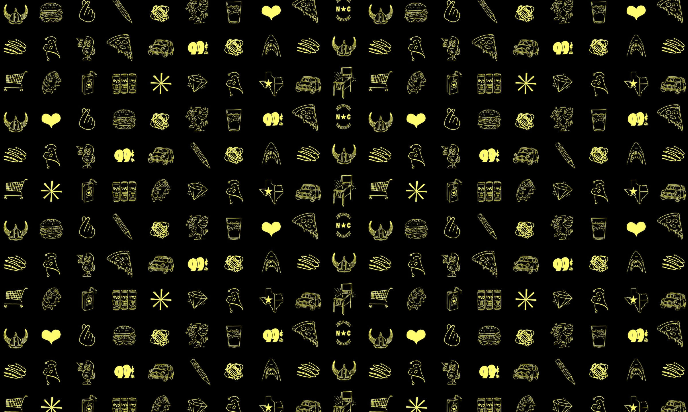
Crack open the Griffin Claw case study to see more of the Griffin Claw Brewing Company brand and packaging redesign.