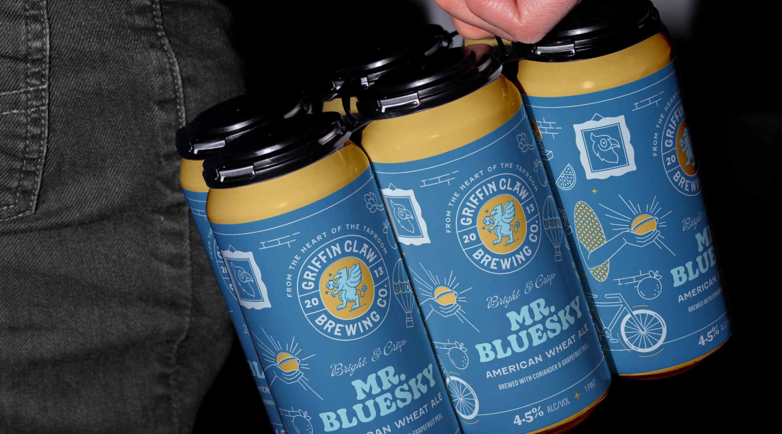
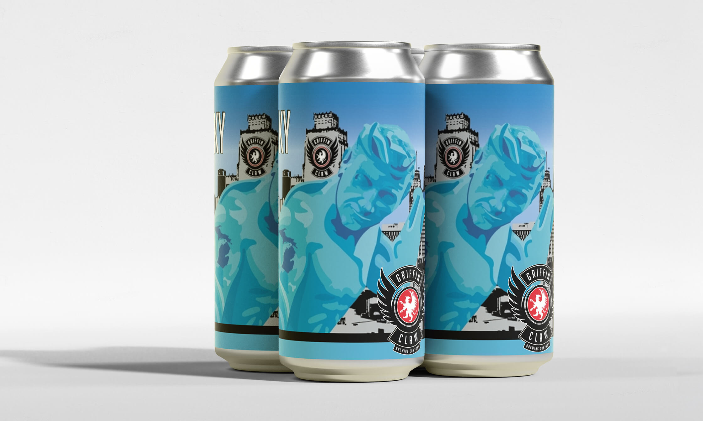
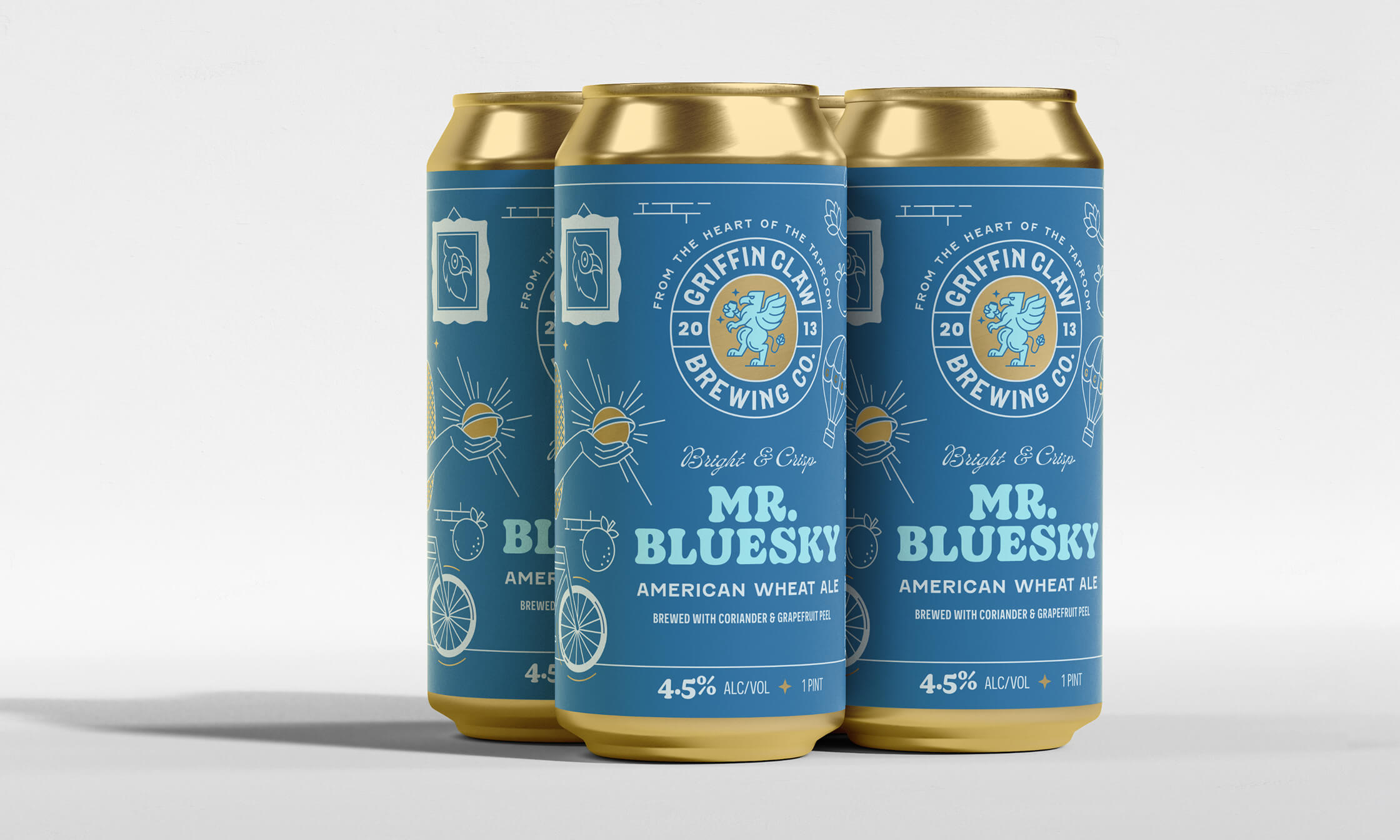
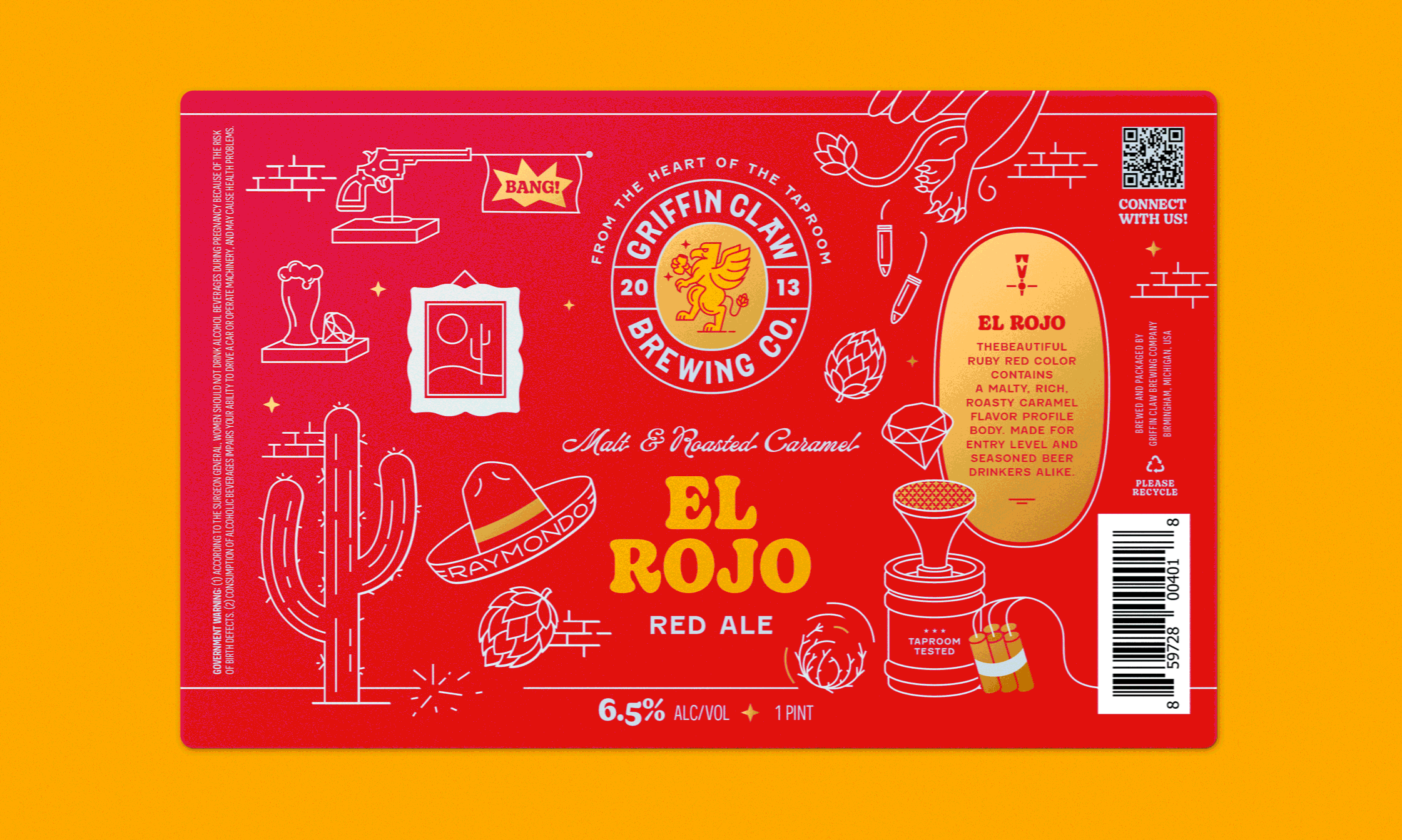
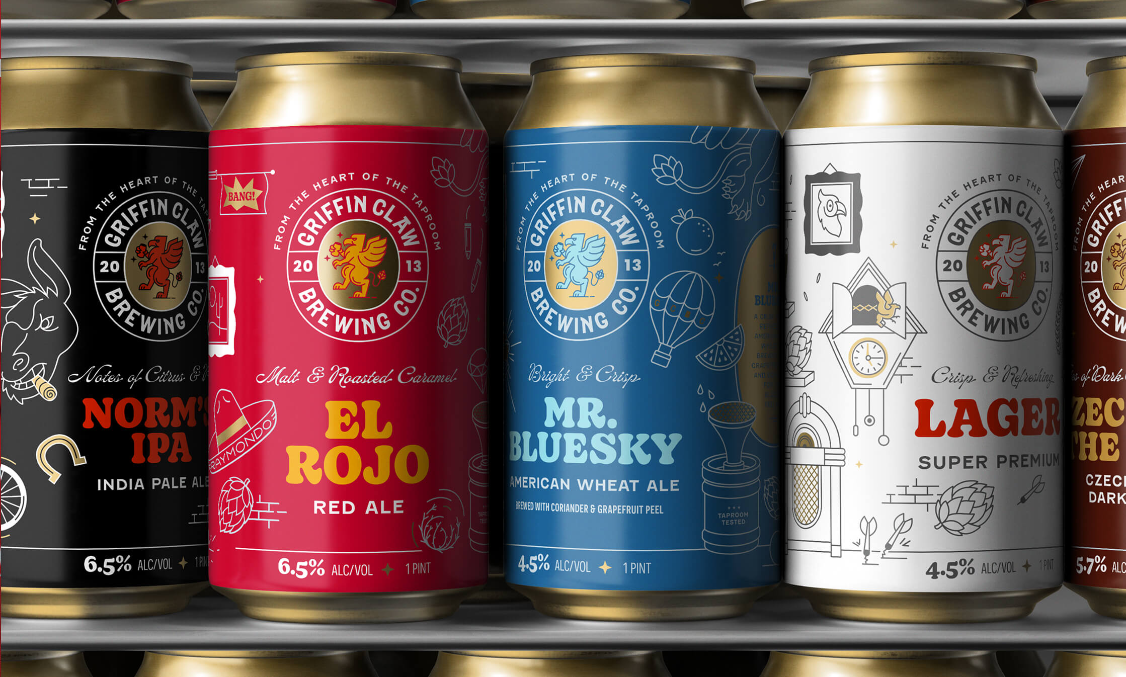
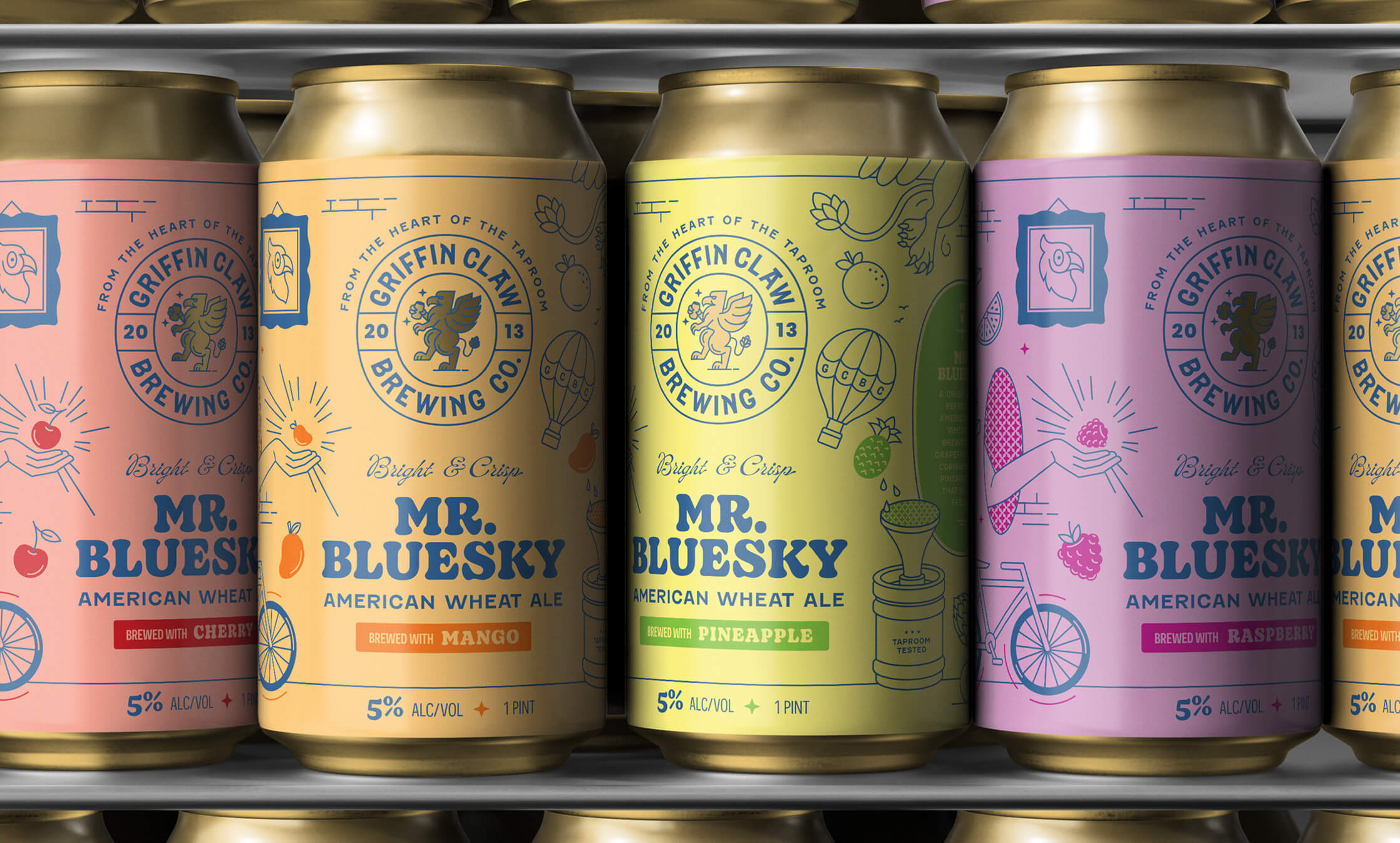
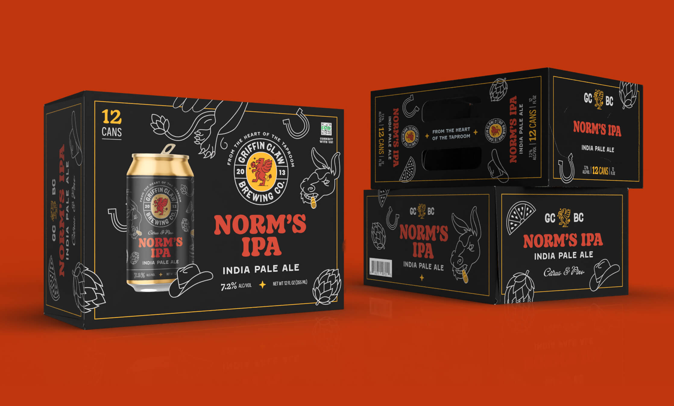
Rebrand and Packaging Design System
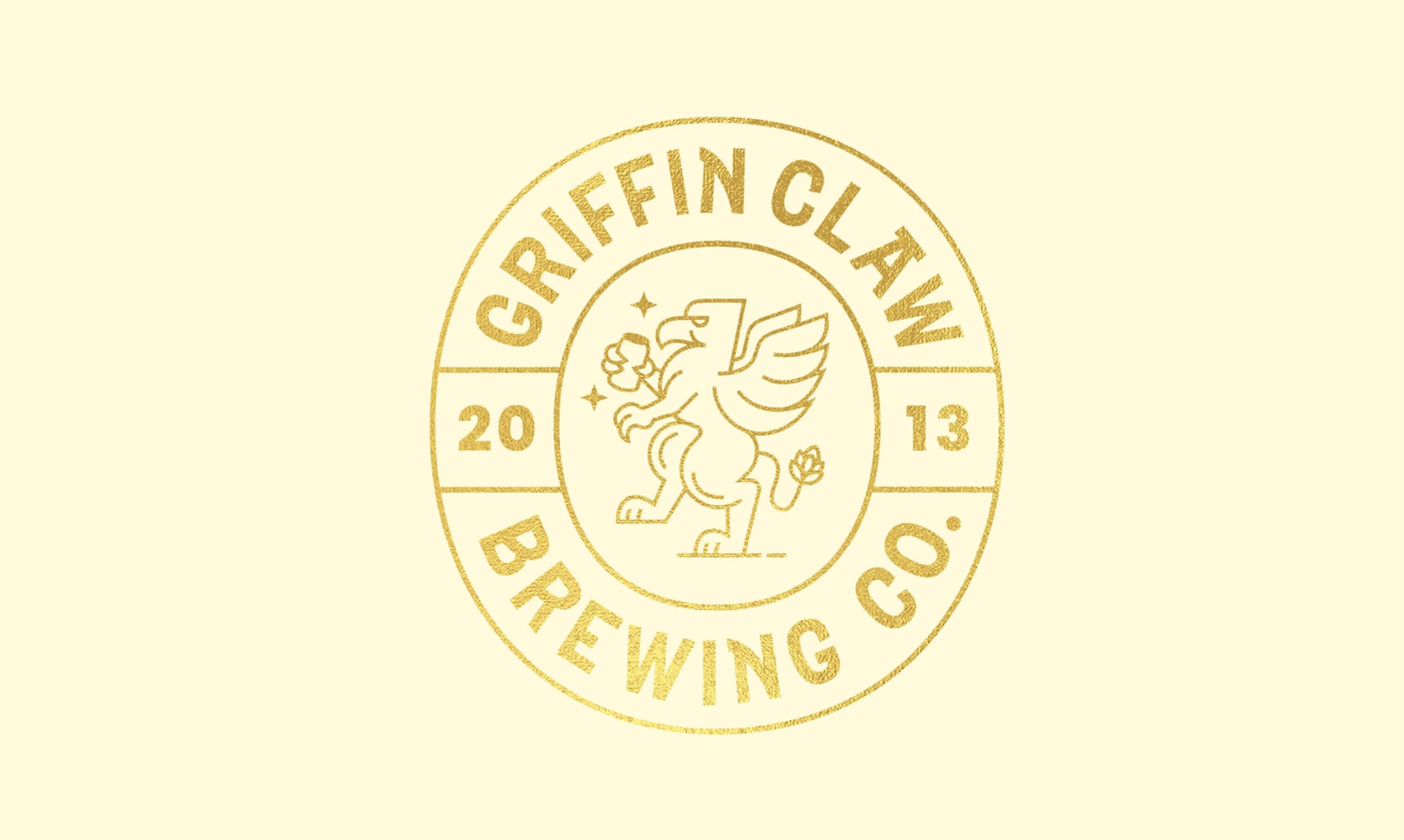
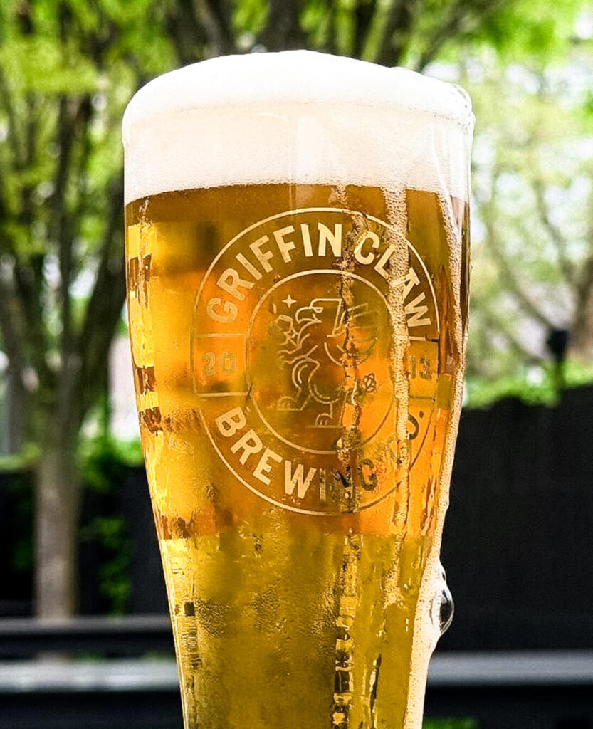
Griffin Claw Brewing Co
Consumer Packaged Goods
Strategy, Branding, Packaging, Illustration, Collateral
24% Increase In Sales
Pat Craddock - Griffin Claw Brewing CFO