A Candid Q&A with the Mountain House Design Team
Mar Rodriguez (Designer/Interviewer):
Hi, you guys. Thanks, and welcome to my interview. Tyler, you haven’t done one of these with me yet, but your interview starts now. Let’s go.
First up: what got you first excited about working on Mountain House?
Tyler DeHague (Lead Designer):
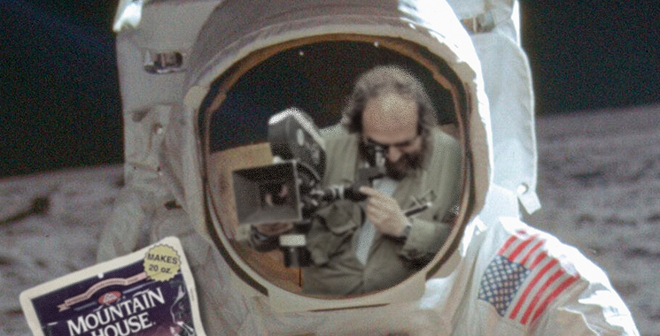
Outdoors is an interesting space. Mountain House is a legacy brand with a lot of history, NASA even took it to the moon!
Mar:
…if they actually landed on the moon.
Shawn McConnell (Creative Director):
Don’t let your conspiracy theories worm their way into our blog, Mar.
Mar:
Just saying! I mean, if they did go to the moon, it’s pretty cool that they brought Mountain House with them. But yes, continue.
Tyler:
Anyway, space food or not, their packaging was outdated. It didn’t even feel vintage, just old. There was a ton of room to evolve it.
Shawn:
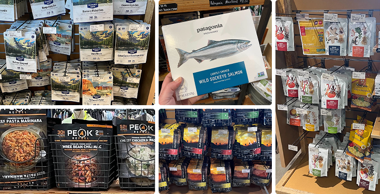
Same. I camp and hike a lot, and never once thought about picking up freeze-dried food. It always felt like it was for hardcore, technical campers. This project was about bridging that gap between extremes and casual users. And the brand had such a great story: astronauts, mountain men, decades in the game. It was right in our wheelhouse.
Mar:
What insight shifted your thinking early on? And I mean like, that lightbulb moment… Where you’re in the thick of it and something just clicks.
Shawn:
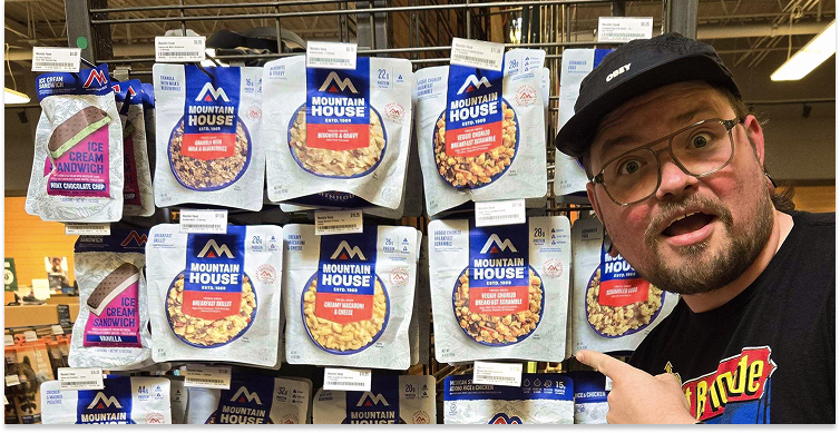
Taste. We did a tasting in Chicago, lined up all the freeze-dried foods from competitors, and Mountain House crushed it. It was way better than anything else out there. But you’d never guess that from looking at the packaging. The relative new comer, Peak, was pushing taste appeal and protein on pack, but it looked like a supplement brand. Black, orange, very “bro-y.”
Tyler:
Yeah, Peak had a hunter vibe. Mountain House was different. Their ambassadors were from all over the spectrum. We saw an opportunity to speak to a wider audience. More inclusive, more everyday.
Shawn:
That was our North Star. They wanted to be the guide for people new to freeze-dried food, not overly technical but still respected by the hardcore users. Kind of the Starbucks of outdoor food. Iconic, consistent, and reliable… everywhere.
Mar:
All right, let’s get into the visuals, my favorite part. Talk to me about the illustration. What was the vibe you were going for, and how did you want it to feel on shelf?
Tyler:
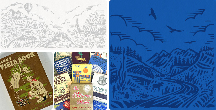
The old illustration had cool detail, but didn’t read from a few feet away. I wanted something more visible and versatile. I looked at 1950s and 60s instructional graphics, matchbook styles, and early Boy Scout materials. That era fit the brand’s origin story.
Shawn:
We worked with Curtis Jenkins from Neighborhood Studio on the new illustration. It pulls in WPA-style influences without feeling dated. A nod to the past, but modern
Mar:
So you didn’t erase the story, you just made it more legible.
Tyler:
Exactly. We didn’t start over. We evolved.
Shawn:
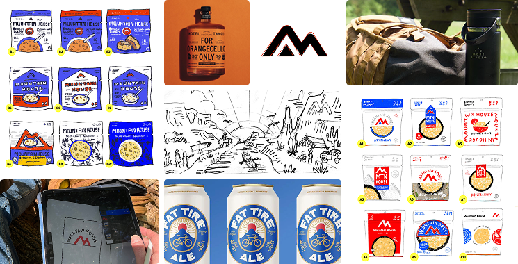
The logo update was another small but powerful win. That little red triangle we added gave us a story. A little red tent, a literal mountain house. It gave us another small brand asset we could flex for campaigns, in-store, even on the bottom of pack.
Tyler:
We also rebalanced the entire lockup and brought in much stronger type. The original mark had some subtle misalignments and tension in the spacing that we corrected. It doesn’t scream “redesign” at first glance, but the refinements made the whole thing feel sharper and more confident. “Mountain House” became the clear hero, not “Adventure Meals.”
Mar:
Okay, wait, before you opened Illustrator or anything, what did it look like? I wanna hear about the messy part. Like the real designer stuff. Doodles, notes, little sketches you made on a napkin or something.
Shawn: Sketches. I sketched the whole plane ride home from that tasting. Then I pulled mood to support the details, color stories, illustration vibes, etc.
Tyler:
Same. Sketches, doodles, swipe. We explored a wide range before locking anything in.
Mar:
Okay, real talk—was there anything you were really into that just didn’t make the cut? Like, you were vibing with it but had to say goodbye? Was anything especially challenging?
Tyler:
Simplicity was hard. Early versions felt too empty, especially without illustration. Getting that balance was tough.
Shawn:
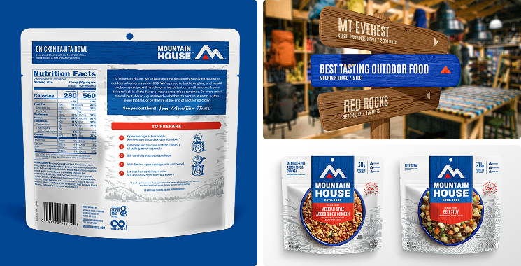
Texture was a challenge, too. The client wanted a lot of real-world grit. They were excited about the trail marker or blaze shape on the front of pack. Think trail signs you see on a hike, wood, old paint, and routed letters. We had to balance that with taste appeal and something that was still simple enough to be iconic.
Tyler:
The back of pack was another one of my puzzles. You have to fit so much: nutrition, instructions, brand story, but still make it feel natural. It took some real Tetris.
Shawn:
And we did it all for like 40 SKUs with wildly different product names. Some were like two words, some were a paragraph.
Tyler:
Like, how do you make “Beef Lasagna” and “Mexican-Style Adobo Rice with Chicken, Pinto Beans, Vegetables, and Chilis” feel like they belong in the same system, and still look good on shelf? That was some serious threading the needle.
Mar:
Okay, but like, was there anything in the final design that people might not catch right away? Not just secret stuff you tucked in for fun, but things you’re proud of that might fly under the radar?
Tyler:
Sasquatch. And Nessie. I fought for those. They’re both tucked into the illustration, little hidden Easter eggs we managed to sneak into the scene. It took some convincing, but I’m glad we stuck with it. I’m all for adding cryptids wherever we can!
Shawn:
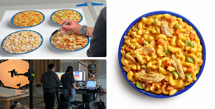
No added food styling on those bowls either. That’s the real deal, hydrated straight from the pouch. That level of authenticity was a mandate from the beginning. It mattered to the client, not just for brand integrity but also because their audience expects honesty. Freeze-dried food can be a hard sell, and showing the real thing on pack, with no dressing or staging, helped build trust.
Mar:
Okay, but like, would you actually buy it now? Not as a designer, not because you worked on it, just you, walking down an aisle, looking for something to eat. Be honest.
Shawn:
I do. It’s a little expensive, but it’s easy, tasty, and lasts forever. I keep it stocked. I might even keep some in my secret prepper corner of the closet.
Tyler:
Honestly, I didn’t even know who Mountain House was when we started. I’m not a regular camper, and it just wasn’t on my radar. But once I saw how big they were in the space, a full wall at REI, for example, and saw how good the food looked on pack, yeah, I’d pick it up now. The design makes it feel way more approachable.
Shawn:
What about you Mar? Would you pick this up?
Mar:
I saw them totally differently after this. Before, I thought they were super niche, kind of intimidating. But now it just feels more open and kind. Like a brand that actually wants to welcome people in, not gatekeep the outdoors. I really love that.
Mar:
Last thing, any final thoughts? Anything you’re walking away with that stuck with you?
Shawn:
Before, it blended into the shelf. Now, it stands out. It looks like food. It looks like a brand. We made it show up.
Tyler:
For me, the biggest takeaway is how much this shifted my perspective. I wasn’t their target user at first glance, but going through the process showed me how much potential the brand had to reach someone like me. Now it feels like something I’d genuinely grab off the shelf.
Mar:
Okay, I think that’s everything! Thank you both for reliving all this with me. It was so cool hearing how much thought went into every little piece! I definitely see the brand (and freeze-dried food!) differently now.