Spoiler alert: it’s more than your logo.
In an ever-evolving aisle of choice, gaining consumer trust and loyalty is essential to growth. Building a standout brand identity early helps ensure that you capture consumers’ eyes, hands, and carts. That’s why brand development looks beyond your logo to incorporate your positioning, mission, messaging, and vision. These elements should also inform your brand’s visual identity to give depth and meaning to your product packaging design.
It’s your turn to think beyond the logo – what’s in your brand’s visual identity?
Visualize your favorite brands – what comes to mind? The swooping, crisp white font on a rich, red background. Polar bears and Santa Claus at the holidays.
The classic red cursive and a white san serif font indicate its lightness. A bright, icy blue mountain range lets you know your beer is at the perfect temperature that fades as the beer warms. A silver, fresh snow shining in the sun.
These are all aspects of visual identity. The four key components are:
Logo
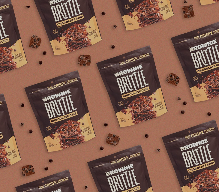
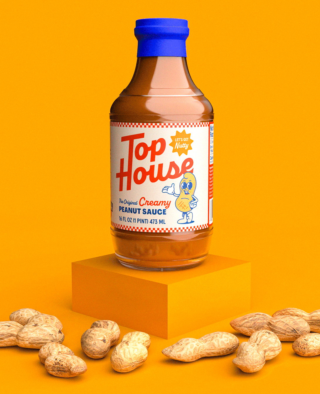
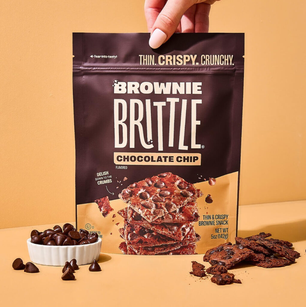
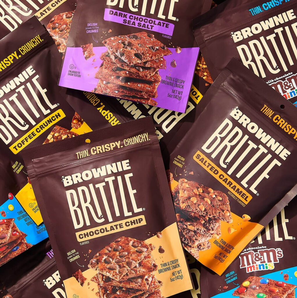
The logo is the most obvious representation of a brand’s visual identity. An effortless and memorable design will help a loyal consumer in their quest to find your brand on the shelf, but it is usually in combination with other visual components, like the color palette.
What makes a great logo? We’ve got some thoughts here.
Color Palette
The psychology of color plays a key role in branding. A brand’s color palette is used to invoke emotions that resonate with experiencing the brand. Brands like Recess use matte, jeweled tones that align with the flavor while not being overly energizing.
Typography
How your words look is just as important as the words themselves. Furthering the connection between the design and the product experience, typography can be playful, stoic, or straightforward.
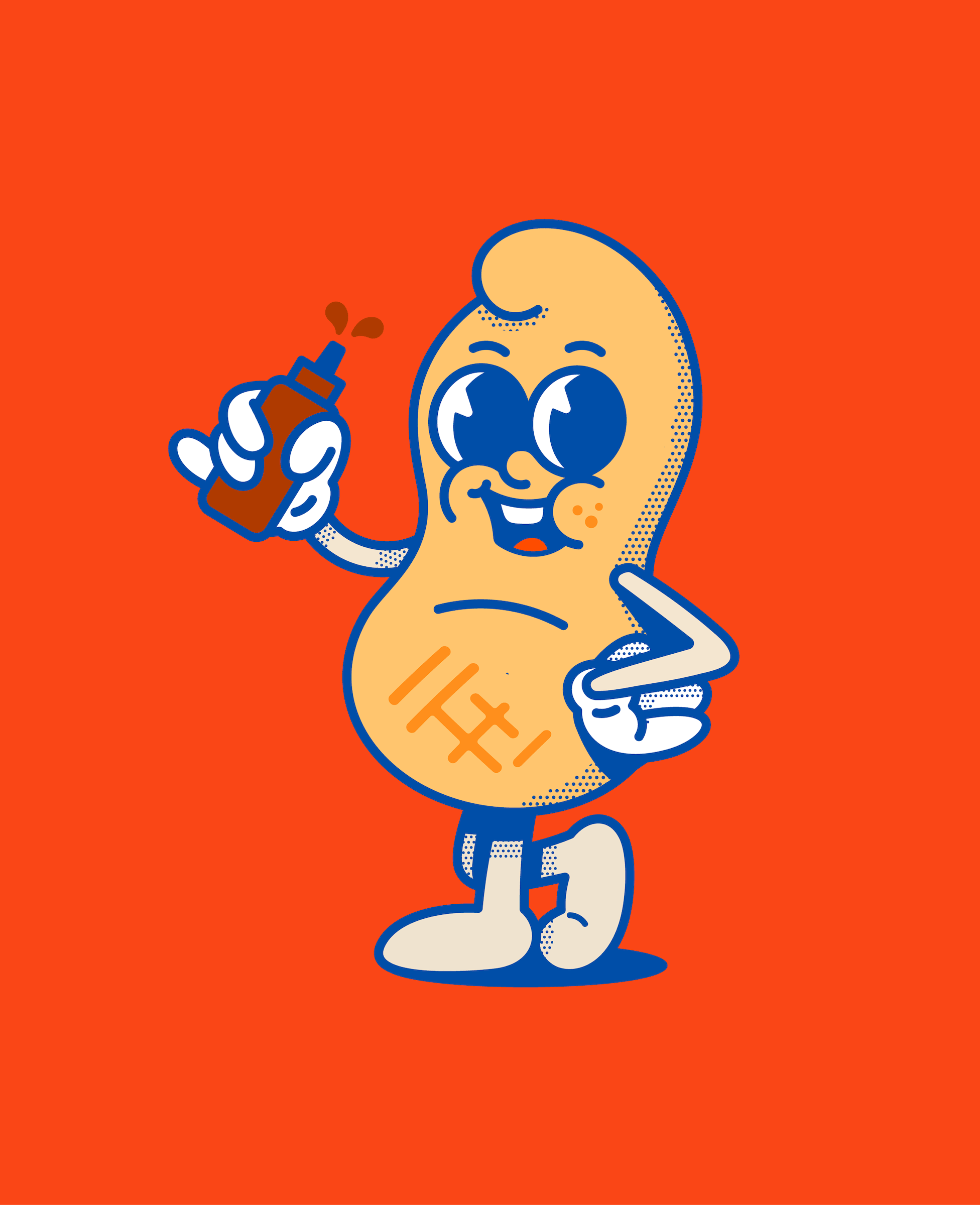
Style
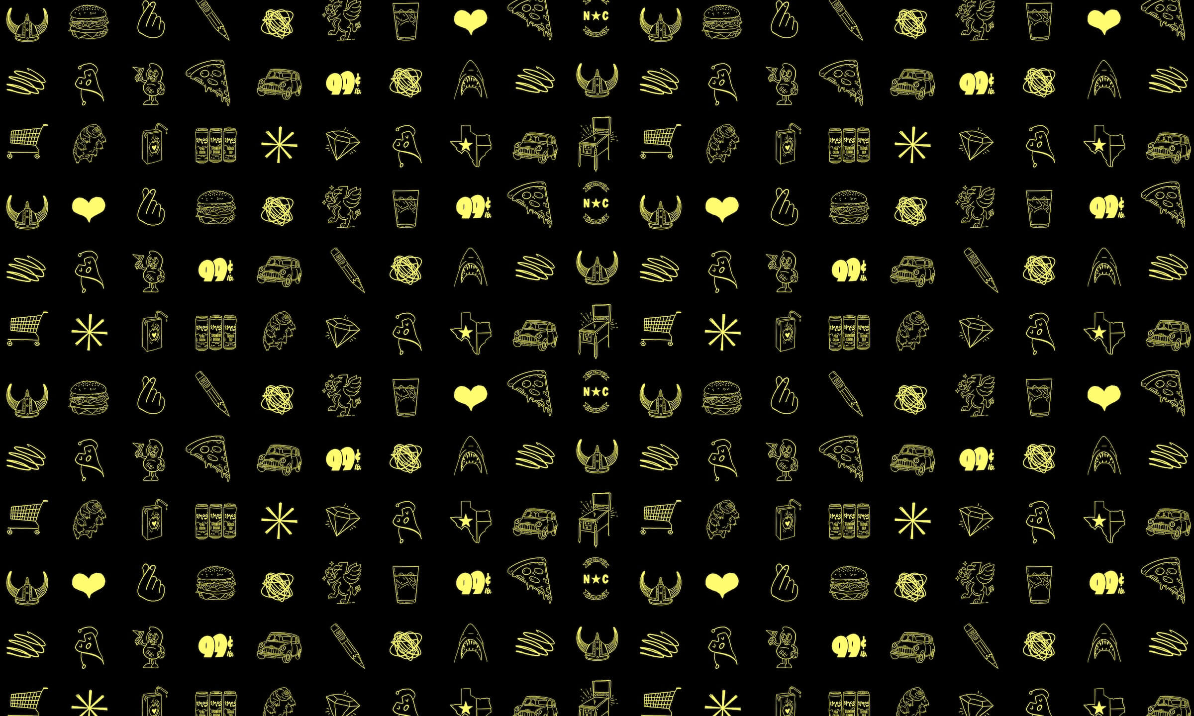
Illustrations, animations and other visual cues are subtle, unifying notes. Style elements touch on key messaging on flavor, nutrition, and customer lifestyle. Communicating how your brand fits into your consumer’s life ensures your brand is easy to buy and is one of 7 Rules for Brand Growth according to Byron Sharp, author of How Brands Grow.
Take a look at how we used these components of visual identity in two recent brand and packaging redesigns.
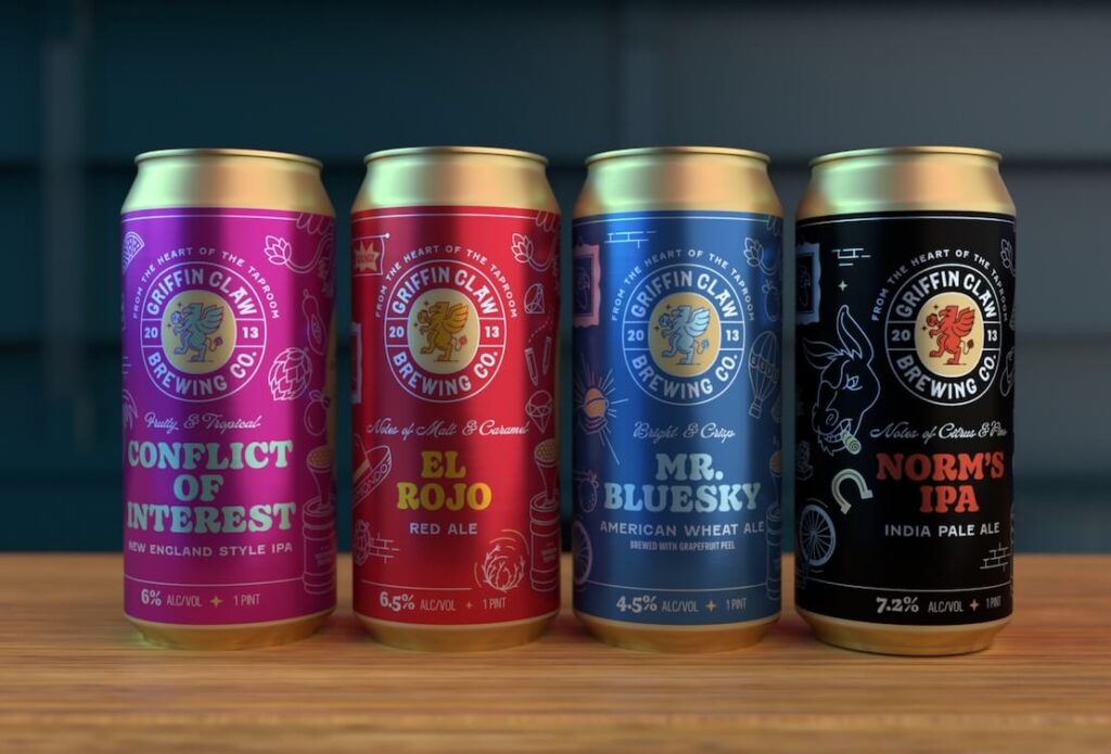
The logo was redesigned to be more functional and flexible, while still maintaining the playful spirit of GCBC.
The primary and secondary color palette allow line extensions to have a distinct look and feel while maintaining the Griffin Claw brand.
The brand is stylized to come to life on the can with the Griffin dropping flavor cues into kegs and updated imagery from original packaging designs to maintain familiarity with long-time drinkers.
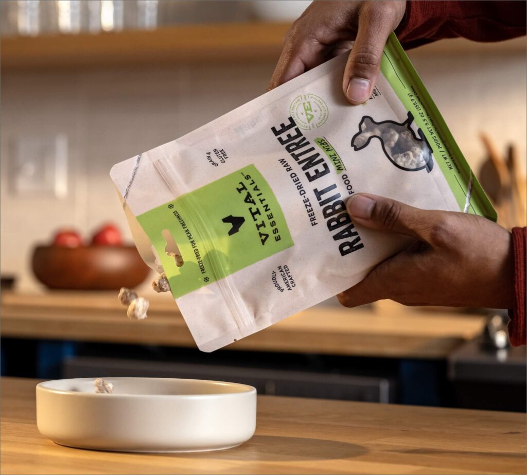
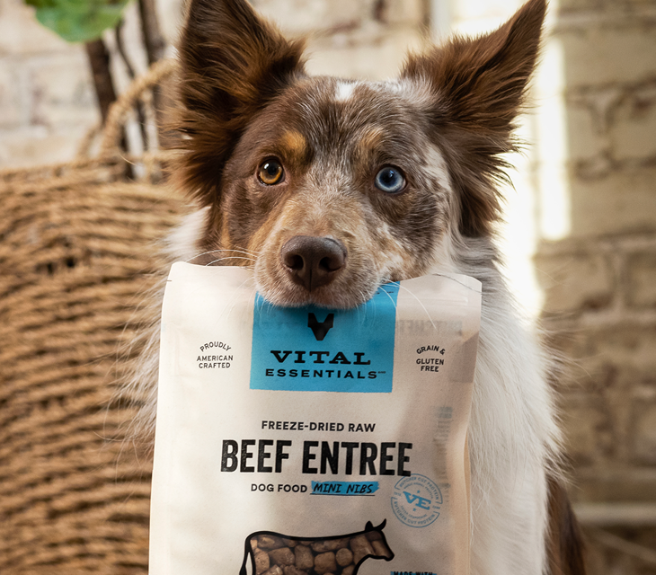
The Vital Essentials logo was designed to reflect our beloved pets as well as the “next in line” tabs at the butcher shop.
The clean color palette and jewel-toned accents capture the consumer’s attention in the aisle and direct them to the important information.
The brand’s style goes beyond the packaging to clearly communicate the butcher experience across Vital Essentials’ marketing efforts. With adaptable style elements, the visual identity is consistent yet robust with executional opportunities.