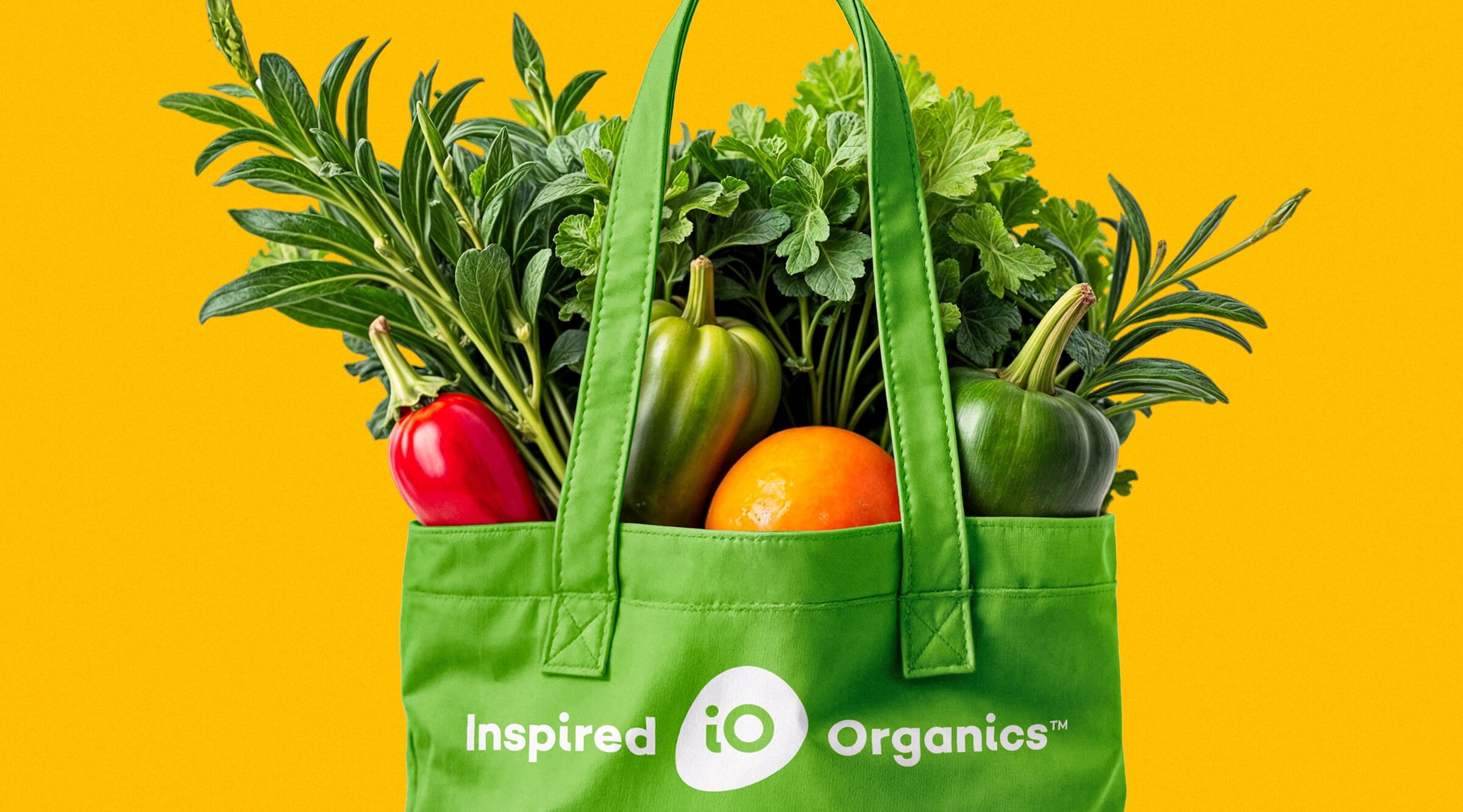
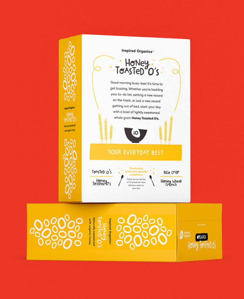
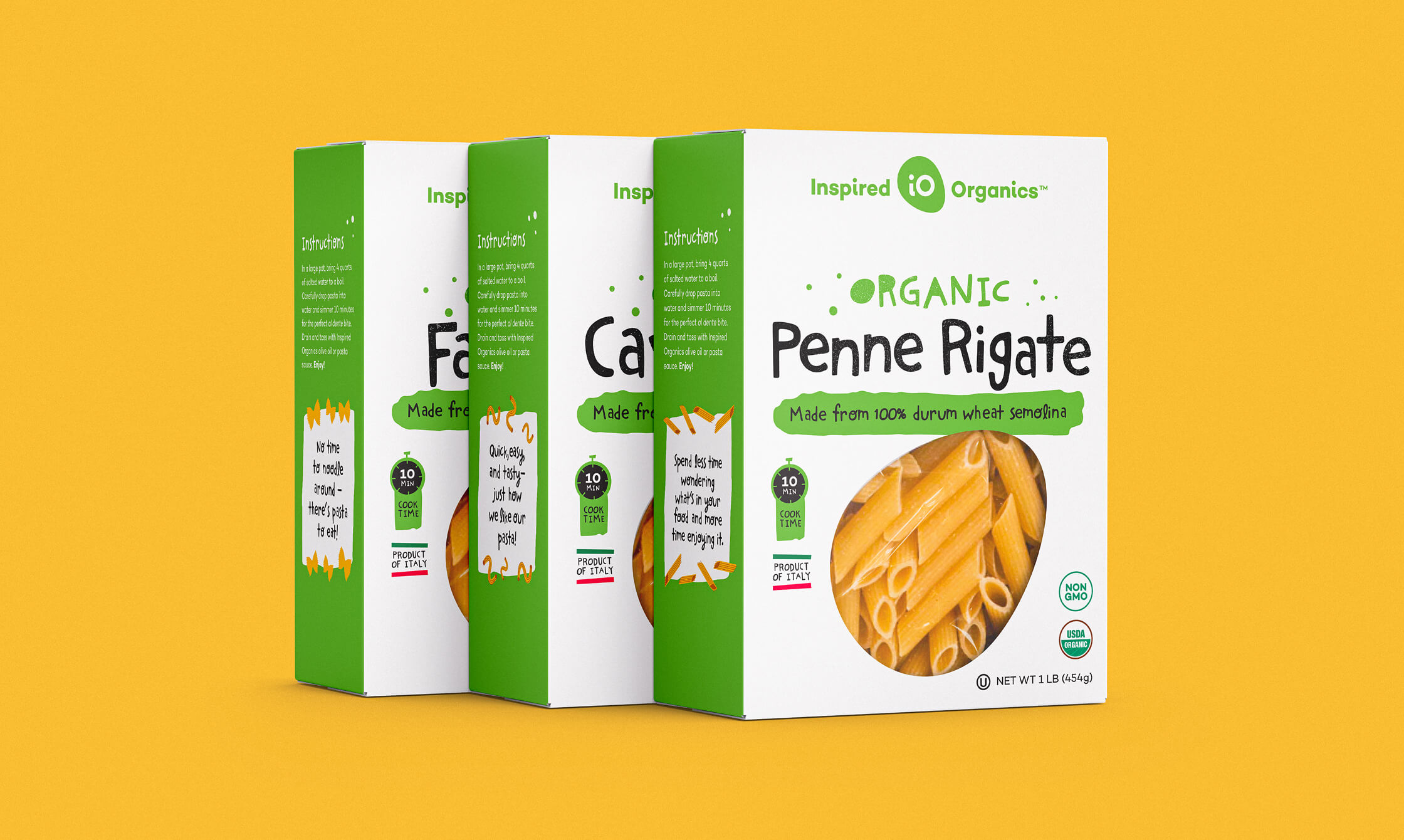
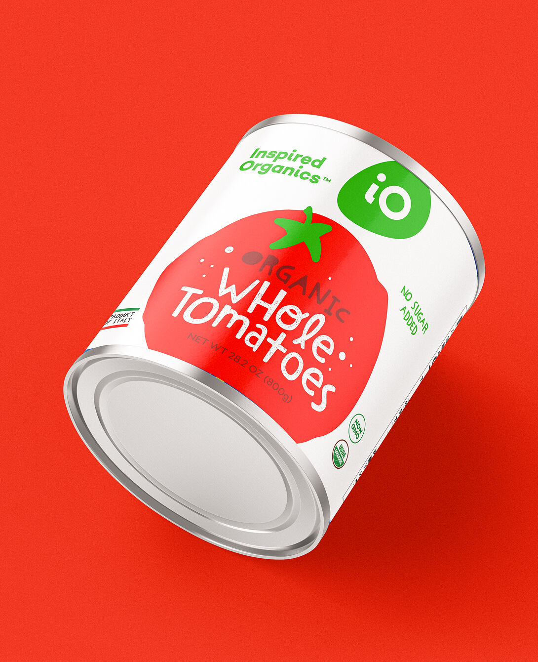
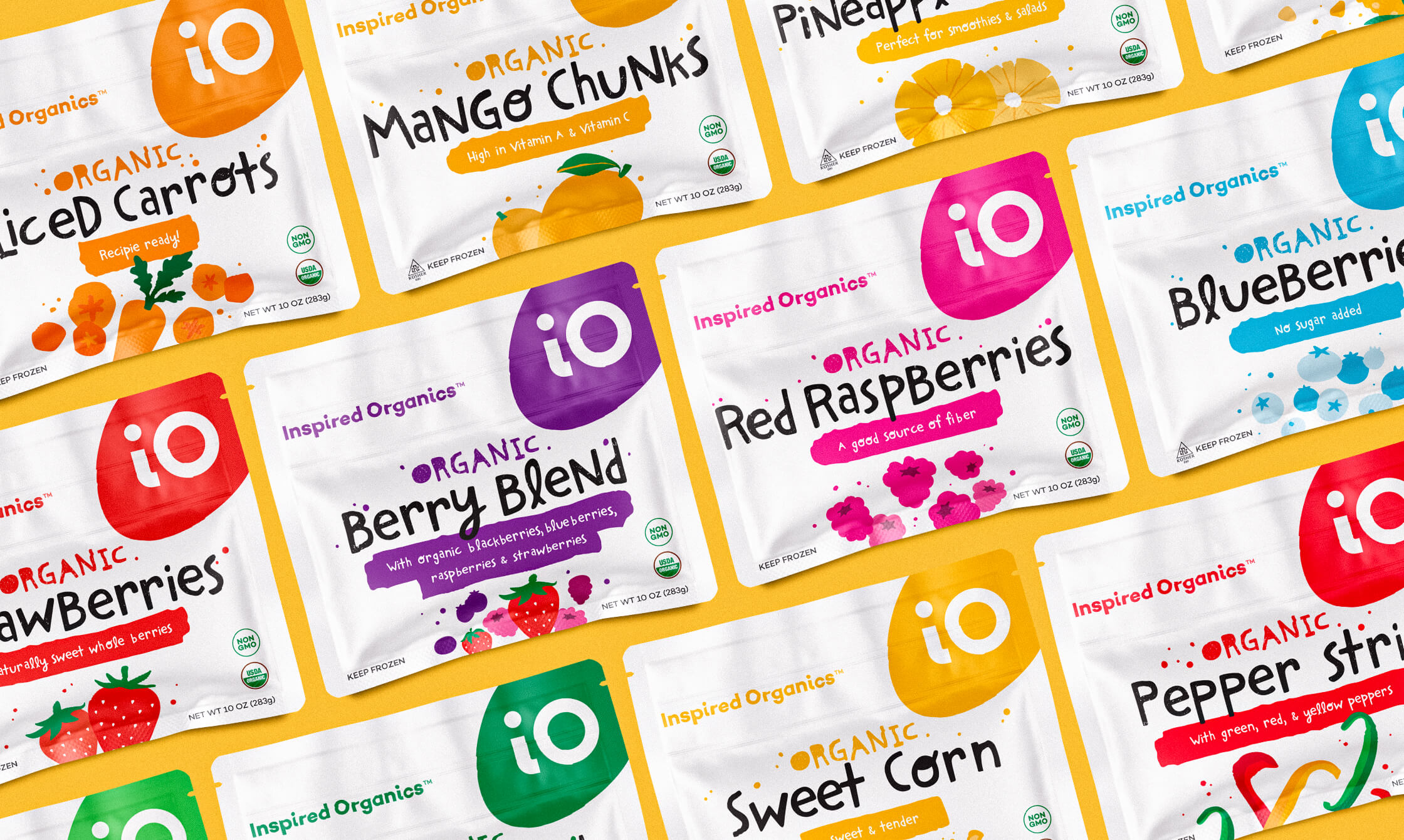
Brand and Packaging Design System
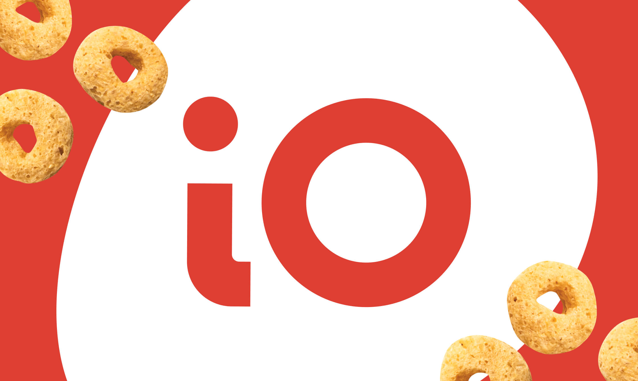
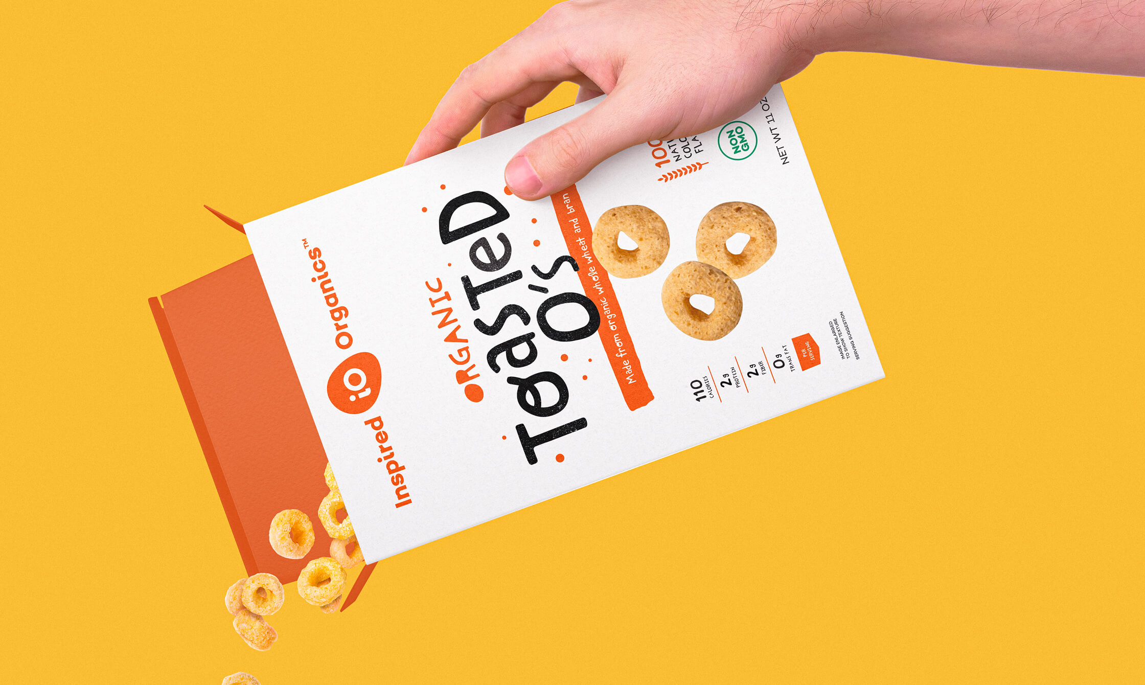
Inspired Organics
Consumer Packaged Goods
Branding, Packaging, Strategy, Illustration
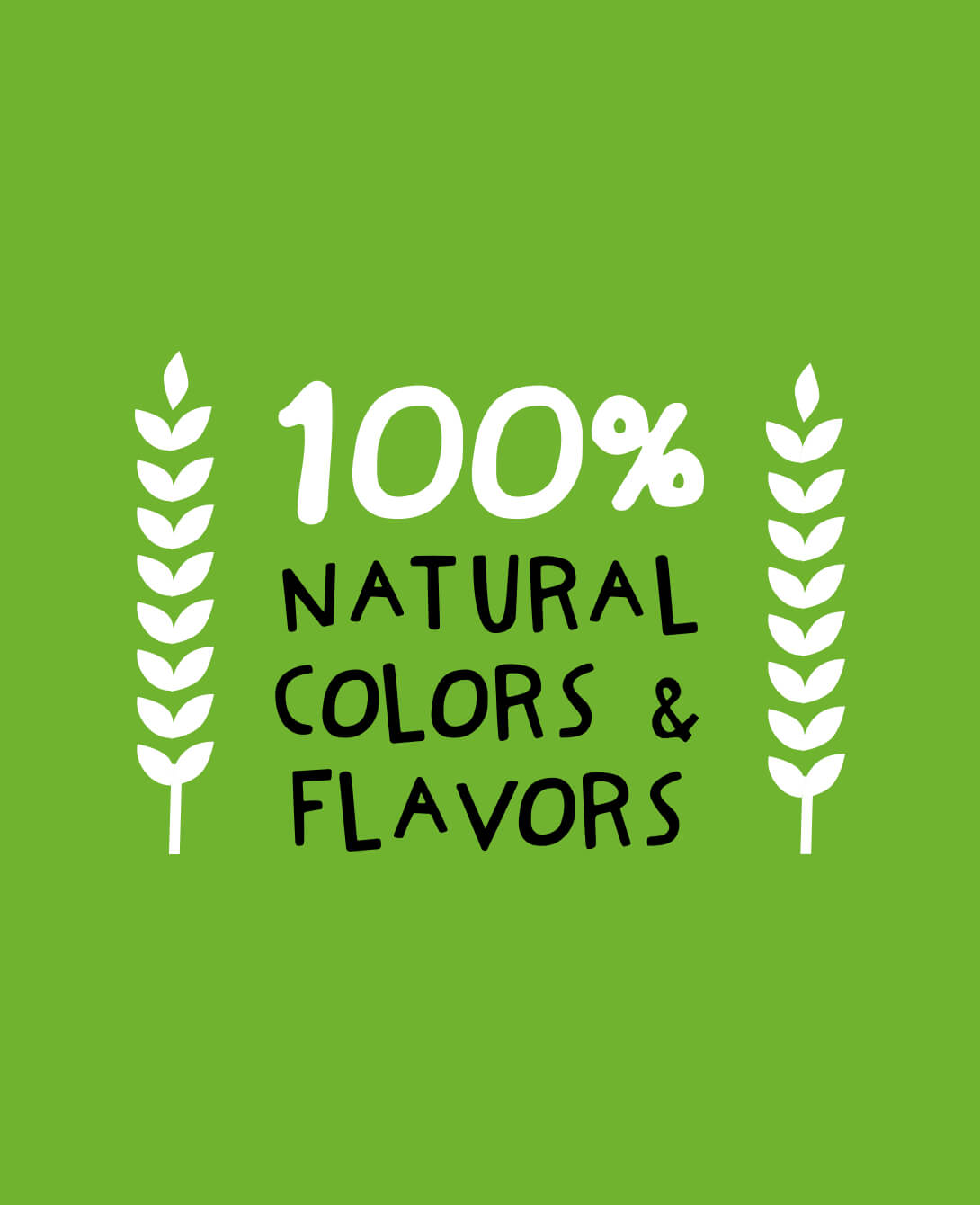
Packaging System Built to Scale Across 180+ SKUs
Joyce Saranathan, VP of Business Development